In Agile project management, it is important to have a clear picture of the project’s reality, see the impacts of your work, and know when things exceed expectations or aren’t following the project timeline. While tools like a Gantt chart help you visualize the project plan, the burndown chart is the best way to visualize your progress against that plan. A burndown chart lets you see the work that still needs to be done in order to arrive at project completion on time.
In this post, we’ll go over what a burndown chart is and its benefits. Then we’ll advance to the more hands-on part, where you’ll learn how to create a burndown chart in Excel. But we’ll also look at the limitations of a burndown chart and why you should be leveraging additional tools. Let’s begin!
What Is a Burndown Chart?
A burndown chart is a visual representation of a team’s or project’s progress over time. With this snapshot, you can analyze your team’s pace and determine if they’re on track to finish on time.
The burndown chart can act like a “scoreboard” for your team, which they check to see how much work there is left and how well they’re doing. Visibility like this empowers your engineers to take ownership over their work. It’s part of what Kathryn Koehler, Director of Productivity Engineering at Netflix, described as “treating your team like adults” on the Dev Interrupted podcast:
The two main types of burndown charts are release and sprint. The release burndown chart tracks the progress of a scrum project’s release or version, whereas the sprint burndown chart is scoped to an individual sprint.
In this post, we’re going to focus on the sprint burndown chart since it is the more popular tool.
Using Burndown Charts for Agile Project Management
A sprint burndown chart is made up of several essential pieces of information:
- A horizontal axis that represents days of the sprint
- A vertical axis that represents work completed. The simplest method is to count the number of tasks completed, but the better approach is to use story points.
- Two lines. One is your estimated or ideal work line, and the other is the actual work line.
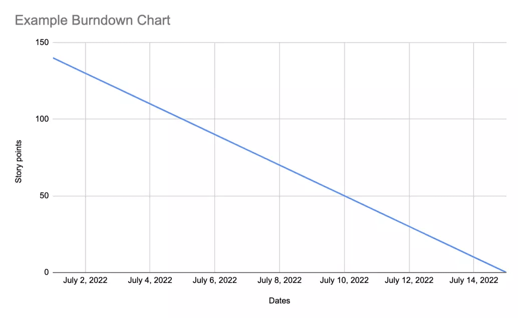
A basic burndown chart looks just like this:
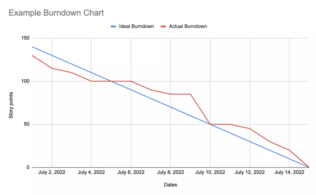
The sprints starts in the upper-left corner of the chart on day zero. The lines slope downward toward the bottom right corner as the project progresses and work is “burned down”.
If the red Actual line is above the blue Ideal line, your team is behind schedule: You have not completed as much as you would have liked. If the Actual line is under the Ideal line, you are moving faster than expected.
With a burndown chart, all you have to do is look at which line is higher in order to answer the question: On we on track to deliver what we committed to?
Creating a Burndown Chart for Your Team in Excel
Not only is the burndown chart easy to read, it’s also pretty easy to create. All you need is a spreadsheet application like Microsoft Excel or Google Sheets.
Step 1: Create Your Table
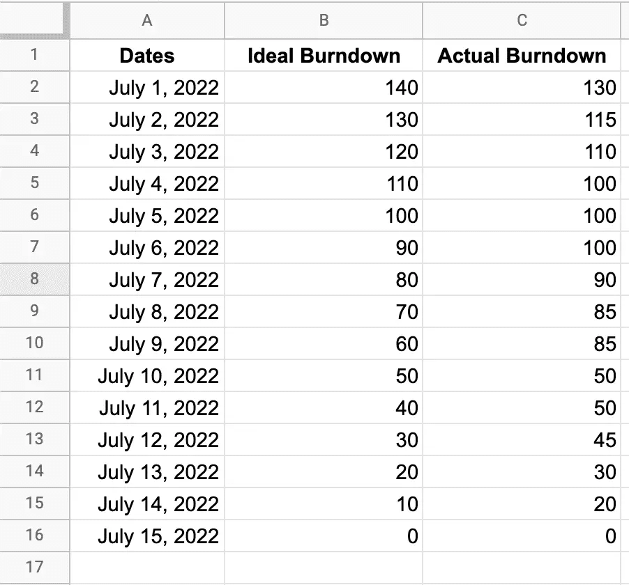
We’ll start by opening a new sheet in Excel and creating a table with three columns. Each column will contain information about the project.
- The first column, “Dates,” will list out the date of each day of the sprint.
- The second column, “Ideal Burndown,” captures the ideal rate at which work will be completed.
- The last column, “Actual Burndown,” will be updated as the project’s story points get completed.
Step 2: Populate Your Table
First, you need to fill in the Dates column with the dates of your sprint.
Second, you need to fill in the Ideal Burndown column. On the first date of the sprint, you should put in the total work (i.e. the total number of story points) your team has committed to. You can then divide that number by the number of days in the sprint to give you the amount of work that needs to be completed each day on average. You fill up the Ideal Burndown column by subtracting that number from the previous day’s number all the way to the end.
You can get more sophisticated and account for productive hours. For example, you can factor into the ideal burndown rate that Saturdays and Sundays will be non-working days whose burndown rates will be 0. Maybe you know that there is a big event, like a team outing, which will reduce work hours and can be accounted for.
Finally, as the sprint progress, you can track your actual burndown rate. At the end of each day, the product owner or scrum coordinator (formerly known as the scrum master) can tally up the number of story points completed that day and enter them into the chart.
At the end of the sprint, you should have a table that looks like this:
Step 3: Create the Burndown Chart
To create our chart, we need to follow these simple steps:
- Select the three columns
- Click Insert on the menu bar
- Click on the line chart icon and select the first graph in the 2D line
At the beginning of the sprint, your chart will look like this:
There is only the Ideal Burndown line. But as the sprint progresses and the team is completing the tasks and story points, your Actual line will be drawn. At the end of the sprint, it’ll look like first example we looked at.
While you can see that it’s not difficult to create a burndown chart using a spreadsheet, it’s still a manual process that requires updating the table every day by hand.
Fortunately, most project management tools can generate burndown charts right out of the box. With Jira, you can set up both sprint and release burndown charts really easily and they’ll automatically update as the team updates issues and projects in Jira.
Limitations of the Burndown Chart
Although using Excel for burndown charts is easy, burndown charts themselves are not the perfect tool.
No Insight Into the Types of Issues Completed
Say someone asks you, “What did you achieve during the sprint?”
If you were only looking at the burndown chart, the best you could say is: “Out of X number of story points we committed to, we completed Y.”
That’s not what the person wants to know. They want to know if you shipped new features or built out internal systems or put out urgent fires.
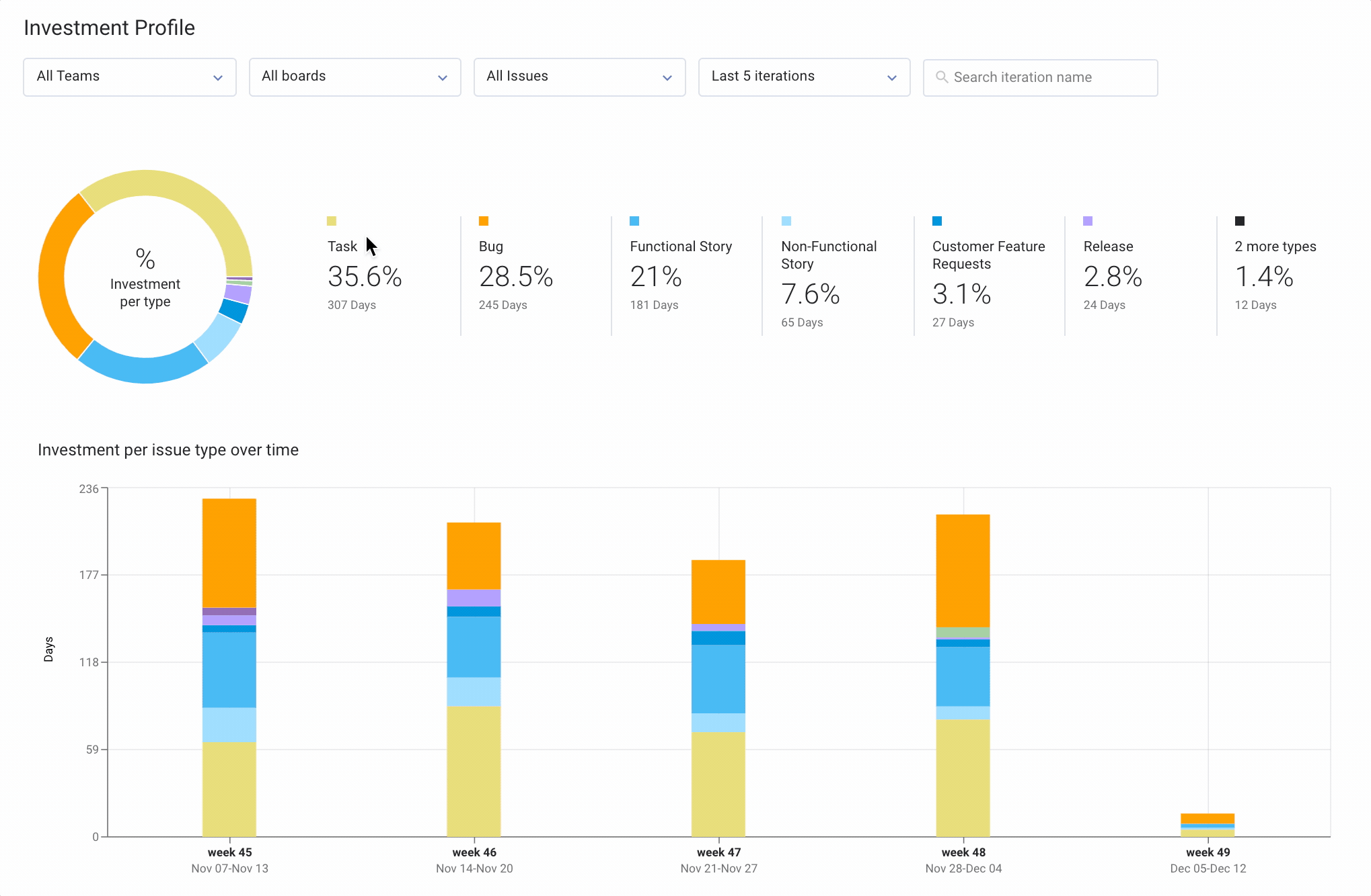
To get that information, you need a tool like LinearB’s Investment Profile metric. It breaks down completed issues into categories like functional or non-functional stories, bugs, or tasks for each of your sprints.
No Indication About Priority
Two user stories may have the same number of story points but have completely different value for the business. For example, maybe a developer accidentally shipped code that is pulling in the wrong credentials for the database. Your application won’t be able to read or write any data, but all you need to do is change one variable to fix this. Although this fix is the same amount of work as, say, changing the color of a button, the impact on the user is way larger!
No System to Monitor Planning Accuracy
Being able to plan accurately is one of the most powerful capabilities for an engineering leader. It enables the rest of the company to align around engineering so that the plans and operations of every team can work in sync. It also improves the experience for your team members. No longer do they have to stomach the disappointment of not delivering by the deadline and the pressure of being a bottleneck for the rest of the company.
You can calculate your planning accuracy using the sprint burndown chart, but it’s a time-consuming process. You have to look at the difference between the amount of work you completed during the sprint and divide this by the amount of work you committed to initially. Then you can manually input this into a chart and track it over time.
Or you can automate the entire process with LinearB’s Planning Accuracy metric. And thanks to our engineering benchmarks, we’ll also tell you how your planning accuracy compares to industry averages. This enables you to truly understand your performance and set realistic goals for improvement.
Conclusion
Burndown charts are a great way to summarize the progress your team is making within sprints and across them. You can create burndown charts manually, but most project management tools, including Jira, can generate them automatically.
But, burndown charts have big drawbacks, as we’ve seen. LinearB gives you the data-driven insights you need to fully understand the work your time is doing and identify areas for improvement.