Scrum reporting is essential to understand your current sprint delivery status and mitigate risks ahead of time. You’re likely already using some form of scrum reports in Jira — but you can always use better agile reporting with deeper insights.
For example, Jira reports may show you that an issue or project is behind schedule or how your team has performed over time. But Jira doesn’t provide you enough context to answer “Why is our lead time so high?” or “Why are so many bugs popping up?”
For that, you need a scrum reporting tool that correlates Jira, Git, release, and incident data together.
In this post, we’ll look at 4 common scrum reports and how you can get a better, consolidated view of your scrum metrics and a new depth of insight.
Table of Contents
What Is Scrum Reporting?
Scrum reporting is vital to helping scrum teams evaluate their progress and adjust work items as needed. While reporting often gets a bad rap from devs, it aligns with the scrum pillars of transparency, inspection, and adaptation. It also reflects openness and respect — the key values of the scrum methodology.
Every scrum team is unique — they come in different sizes, use different technologies, have different types of work, etc. So ideally, each scrum team agrees on a set of metrics to track and defines how to use them. They then use these agile metrics and reports to inform decisions and become more efficient in their sprint planning and execution.
The 4 Most Common Scrum Reports
Below, we’ll talk about the 4 most common scrum reports — and show you how you can improve them.
1. Burndown Chart
A burndown chart tracks the amount of stories that have been completed during the sprint and the total number of stories remaining.
Following each daily scrum meeting, a product owner or the scrum master will update the chart with the number of story points accomplished that day, connecting the dots from the previous day. Working from the upper left corner, make your way down to the lower right one.
A big limitation in the release burndown chart is that it simply looks at story points completed, not whether those story points were part of the planned story points.
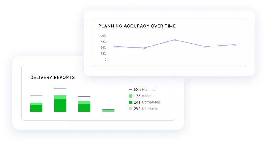
But added work will inevitably happen. In fact, our recent study found that the average sprint planning accuracy for scrum teams was less than 50%. That means your delivery timelines aren’t met more often than they are.
Without the context of added work completed vs planned work completed, you can’t confidently explain why your feature delivery is behind schedule.
LinearB’s planning accuracy breakdown chart gives you exactly that. It correlates data across your tools to identify the things that can affect delivering on your promises — like unplanned or carryover work.
Now, if you discover a trend of low planning accuracy and a large amount of added work each sprint, you can have a conversation with your product teams about scope creep. You’ll then be able to work to resolve this and help your team stay on track with their sprint goals.
2. Sprint Velocity
Sprint velocity measures how many story points on average your team can tackle in a single sprint. You calculate it by looking back over several past sprints and averaging the number of story points completed during that timespan.
Velocity is often used in sprint planning to estimate the team’s capacity in future sprints, or even worse, to pinpoint an exact date for agile projects. But this is a mistake. Team velocity can’t anticipate future outcomes because it only looks backward.

A better way to track your velocity is by measuring your cycle time. Cycle time is the amount of time from the first commit to production release. It can paint a clear picture of how fast your team is moving sprint over sprint.
And LinearB gives you deeper insight into how fast your team is going — much deeper than a sprint velocity chart. First, we break down cycle time into its 4 individual components (coding time, pickup time, review time and deploy time). Then in one click, you can see the cycle times of the individual Git branches that are creating bottlenecks and slowing down your productivity.
With context like this, you can understand exactly why your cycle time is long and find solutions to improve it (and velocity) in seconds.
3. Burn Up Chart
In the same way that the burndown chart tracks progress within a single sprint, the burn up chart does the same across all of them. A burn up chart will track the total work done on an entire project (hours, story points, and all that jazz) against the total amount of work to be completed on a project, including scope changes.

Source: Quickmeme
These burn up charts help you visualize how much effort is going into a project. The completed work line shows your team’s current progress. As projects grow in scope, you’ll be able to see the spread grow. And this scrum report can help you visualize scope creep as a whole.
Your burn up chart is an easy way to show your client and other stakeholders how much longer the project should take if they add more work. But it’s still limited — it doesn’t factor in other projects the team may be contributing to.
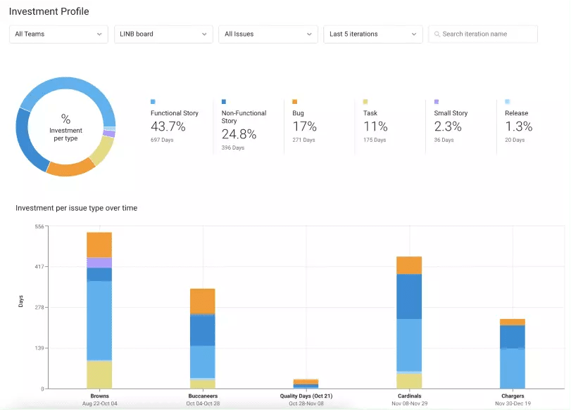
LinearB’s Project Delivery Tracker visualizes all of the projects your team is working on and breaks down the people effort per project. People effort answers the question “what percentage of our team is working on each of our projects?”
This metric provides context needed for a healthy discussion around balancing competing priorities and finite resources. If you’re asked to take on a new project or expand the scope of a current one, you can refer to the people effort report and explain why you need to give and take around competing priorities.
It might just even give you the justification you need to ask for more headcount. 🤔
4. Defects Trend Chart
A defects trend chart tracks the total defects opened versus closed over time, showing whether the trend is increasing or decreasing. Despite your best intentions, you can’t always address bugs in the same sprint or release where you discovered them. So, some issues — often the ones that don’t prevent the release altogether — remain for the next sprint.
By providing agile teams with a visual representation of defect trends, they can develop a sense of urgency and responsibility for resolving these defects. However, a defect trends chart lacks the context of how much time your team is spending fixing defects compared to releasing new features.
In addition to people effort, LinearB’s Project Delivery Tracker provides an investment profile breakdown. Our investment profile correlates your Git and Jira data, so it shows you the types of work your team is executing. This profile is commonly broken down into stories, non-functional story work (like paying down tech debt or optimizing existing functionality), bugs, support, customer demands, and hotfixes. You may even have additional categories specific to your business.
Just like people effort, investment profile provides the necessary context that empowers you to have productive discussions about competing priorities and limited resources. You’ll be able to explain why you need to focus your attention on certain types of work that may have been neglected in favor of releasing new features, such as resolving defects and bugs that may be crucial for customer retention.
How to Get Better Scrum Reports
Building scrum reports exclusively in Jira has serious limitations:
- The reports can only leverage Jira data
- The reports require good hygiene to really be useful
- It takes a lot of work to get all the need-to-know information in a single report
Jira should be considered a single data point, not a complete source of truth. By correlating Jira & Git activity, LinearB gives you a consolidated view of your scrum team’s delivery status and deeper, actionable insights that help you lead more effectively.
Whether you’re looking for trends over several iterations or real-time blockers for your current sprint, we’ve got the scrum reports you need right out of the box. Get started today!