
LinearB’s new Team Performance Dashboard uses team-based metrics to show data trends across time.
Every team I’ve ever worked on has been unique. Some teams have had more experience, some of them were ultra efficient, others were a lot of fun. But none of them produced the same output in terms of agile velocity. When companies decide to start tracking development performance metrics, it’s important to keep a team-based performance focus, and establish unique baseline metrics using historical data.
Establishing Baseline Performance Metrics
“I need to track performance across my development teams. How do I get started?” This is one of the most common questions I hear from engineering leadership. My answer is always the same, start by looking at the data you already have.
LinearB’s new Team Performance Dashboard was built to help development teams analyze existing Git and Project Board data, providing baseline team metrics. These baseline metrics act as your team’s foundation on which to improve. Tracking team metrics like Cycle Time, PR Sizes, and Rework Changes help teams discover workflow bottlenecks and to validate improvement across iterations.
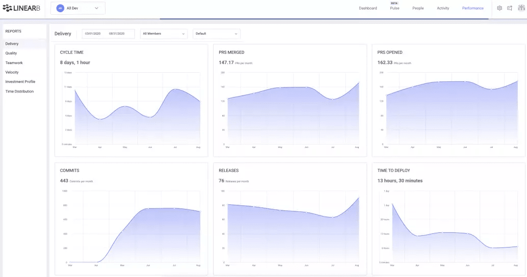
The Team Performance Dashboard provides team-based metrics across time. We grouped our performance metrics into categories based on how they affect the team. The Delivery, Quality, and Teamwork report pages use historical Git-based data to present trends that help teams improve in each category. While Velocity, Investment Profile, and Time Distribution use data from your Project Board tool to help teams understand and visualize how their time is being used.
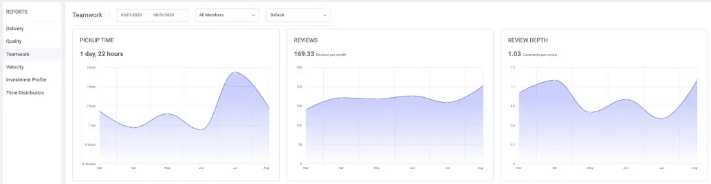
Let’s take a closer look at the Teamwork Report. You’ll see we are tracking:
PR Pickup Time (The amount of time it takes from the pull request opened until review begins)
Reviews (per month in this example)
Review Depth (The number of comments per review).
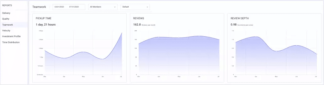
Each of these metrics tells a story about how the team is working together. Pickup time is a great example (this is LinearB’s real data by the way). We saw a sharp spike between June and July. Being able to track and view this data allowed us to:
- Identify a Workflow Issue
- Discovery Why
- Create a Plan for Improvement
So we knew we had a pickup time issue, next we had to discover why the team was taking longer to pick up PRs for review. The easiest way for us to discover why this issue was happening was to correlate the spike in Pickup Time to similar changes in data across the same time period. By looking at the Quality Report, we can see a similar delta in PRs Merged Without Review and a significant increase in PR Size from June to July.
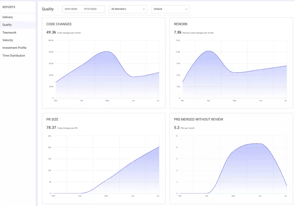
Decreasing the number of PRs Merged without Review is a good thing. It’s something we as a team were focusing on improving during June. But a decrease in PRs Merged without Review meant more reviews were happening. Larger PR Sizes meant reviews were taking more time.
We didn’t want to change the amount of reviews that were happening, but we needed to get our Pickup Time down. So we needed to decrease the amount of time spent per review, and that meant focusing on decreasing our PR Sizes. How did it work out?
Our plan worked! We identified a workflow issue, used data to figure out why, and validated the improvement our plan enacted.
It is worth mentioning that this is just one of a thousand examples of how we solved the problem. A rise in Pickup Time can just as easily mean that two people on the team were on vacation that month or someone left the team or any number of things. Life has a way of presenting new challenges that can be hard to track and improve with data, but we can try : )
Exploring Trends Across Time
Visualizing team data over time is one of the most useful ways to use LinearB’s Team Performance Dashboard. One of the most popular use cases for dev team leads is to show their team’s time investment profile to company leadership. At many organizations it is too easy to continuously focus on new work and not commit enough time to support or non-functional tickets. Showing the amount of bugs each team has needed to invest time into and the resulting impacting on the ability to deliver on new stories is a great way to get this point across.. At this point, being able to show leadership how bugs and hot fixes affected the team per iteration become invaluable.
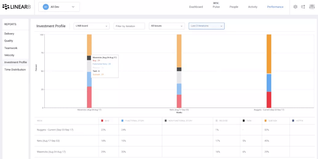
This is just one great example of how being able to view your existing Project Board and Git provider data will help development teams communicate more effectively with each other and the business.
Another interesting example of visualizing data over time is to look at how working from home full time affected our team.

When we all started working from home at the end of February, you can see how our cycle time rose nearly 100%. This was due to a variety of factors like people starting to code more, communicate less, and merging higher than average release sizes.
However, knowing what our baseline metrics were across Delivery, Quality, and Teamwork categories, we were able to pinpoint why our Cycle Time had increased, make a plan to fix it, and validate improvement. In case you are wondering, we discovered our Time to Deploy (movement from PR Merge to Deploy) had also increased sharply, showing that once our team started working from home we weren’t communicating and coordinating as efficiently.
When I was VP of Engineering there were a bunch of other times I wish I had this form of data tracking to help me make or validate decisions. A couple examples that come to mind are:
- Reorganize people into different teams
- Start new projects or initiatives
- Breakout services from monolithes
- Changing from Kanban to Scrum
- Try to improve specific metrics like PR review rates
All of these changes and initiatives can now be tracked and improved using data.

Explore your team’s data trends today with LinearB
Focusing on Team-based Metrics
The way leaders use data to drive their teams defines the development culture at a company. At LinearB we use data to drive our retrospectives and one-on-ones, but always in relation to team improvement, not individual output.
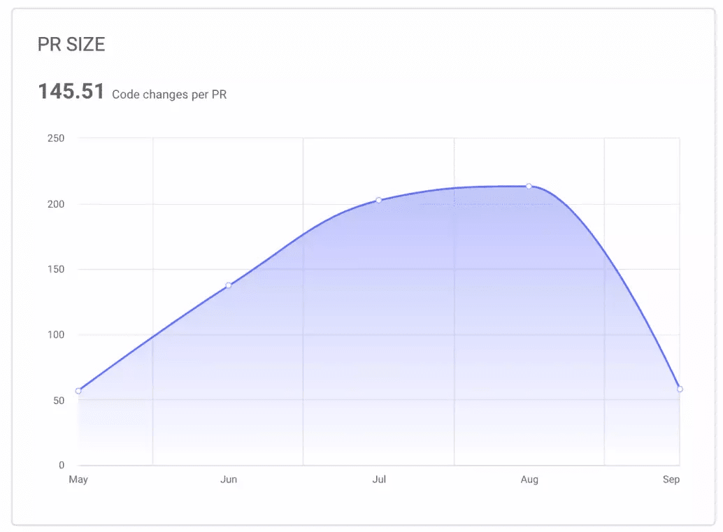
PR Size is one of those great team metrics to review during retrospectives. Smaller PR Sizes means less risk and shorter review times. They also help team leaders make sure everyone is one the right path more regularly. Trying to improve on this metric on a regular basis helps the entire team.
We as a development community need to start using more balanced data to improve our teams. Many of us use agile velocity because it’s available and easy to track. But that doesn’t mean we can’t evolve. LinearB’s new Team Performance Dashboard provides a balanced look at team-based metrics. Having the ability to dig into Delivery, Teamwork, and Quality metrics allows team leaders to diagnose workflow issues, form a plan to fix them, and track improvement over time. I invite you to discover new ways to improve your team with our Team Performance Dashboard today.