Are you still relying on burndown charts to track your engineering team's progress? While these simple visual tools gained popularity with the rise of agile methodologies, today's complex software development demands more sophisticated measurement approaches. Your engineering team deserves metrics that capture the full picture of delivery, quality, and impact, not just task completion status.
Many engineering directors and team leads continue using burndown charts because they're familiar and easy to understand. But these charts often mask critical issues like technical debt, code quality problems, and process bottlenecks that can derail your delivery timelines and impact business outcomes.
A chart that only tracks tasks doesn't show you the real risks hiding under the surface. Let's explore why burndown charts fall short and what metrics truly help your team deliver exceptional software products.
What Is a Burndown Chart? (And Why It's Popular in Agile Teams)
A burndown chart visually represents the relationship between work remaining and time available to complete that work. It plots a downward-sloping line that "burns down" as tasks move to completion, giving teams a quick visual reference for sprint or release progress.
These charts gained popularity because they:
- Provide an at-a-glance view of progress toward sprint goals
- Create transparency around team velocity and capacity
- Help product managers forecast completion dates
- Simplify complex work tracking into an easy-to-digest format
Burndown charts became ubiquitous because they're built into virtually every project management tool. From Jira to Azure DevOps to Monday.com, these tools default to burndown visualizations, establishing them as the standard reporting mechanism for many teams.
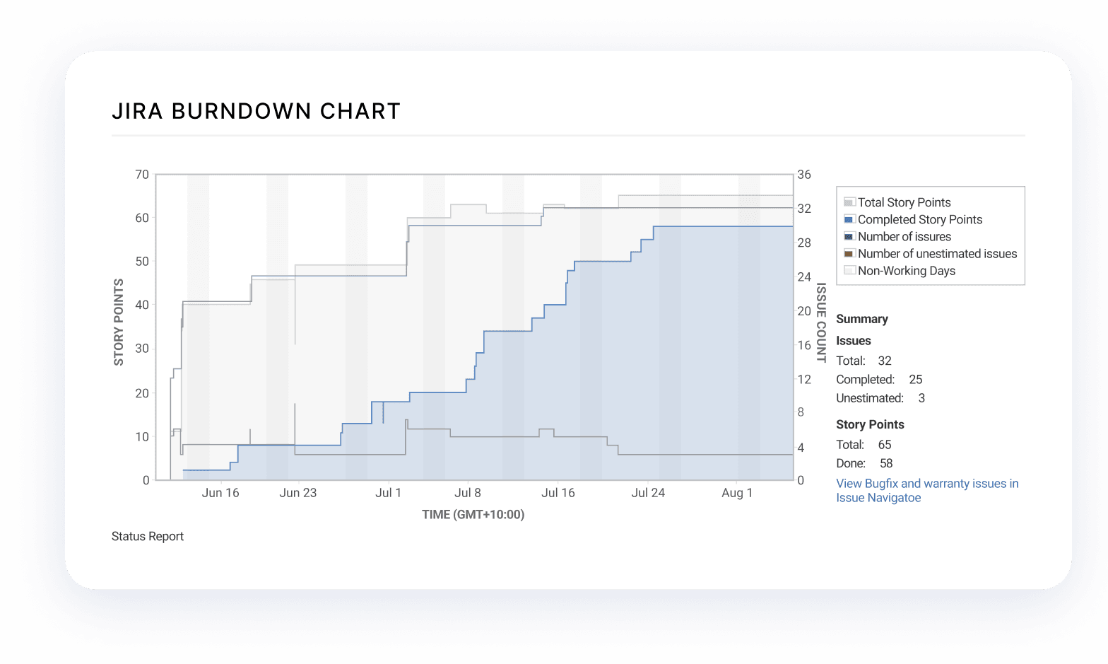
This tool-driven standardization created a "this is how we've always done it" mindset, which perpetuates antiquated measurement approaches even when they don't serve modern engineering needs. Many teams continue using burndown charts not because they're optimal but because they're readily available in existing tooling and familiar to stakeholders.
The classic burndown chart tracks story points or task hours on the vertical axis against calendar days on the horizontal axis. An ideal line shows steady progress, while your actual burndown line reveals whether you're ahead of schedule, on track, or falling behind.
For scrum teams working in defined sprint cycles, burndown charts offer a lightweight mechanism to visualize daily progress. Product managers value them for checking sprint pacing and communicating status updates to stakeholders.
The Two Types of Burndown Charts You Need to Know
Not all burndown charts serve the same purpose. Understanding the different types helps you apply them more effectively within your development process.
Sprint Burndown Chart
Sprint burndown charts track daily progress across a single sprint—typically a 2-4 week timeframe. This focused view works well for short, predictable work cycles where scope remains stable.
Key characteristics of sprint burndown charts include:
- Daily updates showing progress against planned sprint capacity
- Clear visualization of team velocity within the current sprint
- Easy identification of potential sprint goal risks
- Simplified tracking suitable for daily standups and team discussions
Sprint burndowns help teams answer critical questions like "Will we complete all committed stories by sprint end?" and "Are we maintaining a sustainable pace of work?"
Release Burndown Chart
Unlike sprint burndowns, release burndown charts track progress across multiple sprints toward a major release milestone. These charts help leadership teams monitor longer-term project health and forecast delivery dates.
Release burndowns typically:
- Display progress across weeks or months rather than days
- Track epics or features instead of individual tasks or stories
- Help predict when a significant body of work will be complete
- Provide visibility into release-level progress for stakeholders
Product and engineering leaders use release burndowns to answer questions like "When will this feature set be ready for customers?" and "Are we on track for our quarterly release goals?"
However, release burndowns become increasingly misleading when requirements evolve or scope changes, a common reality in modern product development. This limitation represents just one of several significant drawbacks to over-relying on burndown charts.
Each type of burndown chart serves distinct purposes in your agile workflow. Sprint burndowns help with tactical execution, while release burndowns assist with strategic planning. However, both share fundamental limitations that we'll explore in the next section.
When implemented correctly, burndown charts provide a simple visualization tool. But their simplicity comes at a cost, they fail to capture critical aspects of modern software development that directly impact your team's success.
Why Burndown Charts Are Misleading for Modern Engineering Work
As engineering teams tackle increasingly complex projects, burndown charts reveal significant limitations that can mislead both teams and stakeholders about actual progress and health.
Task Completion ≠ Value Delivered
Tracking tasks alone creates a dangerous illusion. Your team might burn down story points at the perfect rate while delivering minimal customer value. Here's why:
- Completed tasks don't automatically translate to user-facing benefits
- Quality metrics remain invisible in task-based tracking
- Security, performance, and accessibility improvements get reduced to simple checkboxes
- Innovation efforts often defy neat categorization into predictable task units
When you focus exclusively on task completion, you can miss critical signals about what truly matters: building secure, maintainable, high-quality software that delivers business impact.
Technical Debt, Refactoring, and Research Are Invisible
Burndown charts fundamentally struggle with activities that don't fit neatly into the "task completion" paradigm:
- Technical debt remediation often requires exploration before estimation
- Research spikes generate knowledge, not completed features
- Refactoring improves code health but doesn't change functionality
- Infrastructure improvements provide foundation for future work
These activities frequently increase short-term work remaining, causing your burndown to trend upward instead of downward. This creates false alarms or encourages teams to avoid necessary maintenance work to "stay on track."
Scope Creep and Agile Reality
Modern agile development embraces changing requirements as teams learn from users and market conditions. Burndown charts, however, operate on a fixed-scope assumption that contradicts agile principles:
- Changing requirements causes burndown distortion
- Additional discoveries during development aren't reflected accurately
- Scope adjustments require manual chart resets
- Learning-driven development conflicts with fixed estimates
What the Burndown Shows | What's Actually Happening |
| Sprint will finish early | Critical edge cases discovered but not yet added to scope |
| Team is behind schedule | Engineers making wise technical investments for future speed |
| Steady, predictable progress | Work artificially chunked to fit tracking system |
| All work is equal | Some tasks carry disproportionate risk or value |
Burndown charts create an oversimplified view of complex work. This can encourage counterproductive behaviors like story point manipulation, task-splitting theater, or avoiding necessary technical exploration.
When It Does Make Sense to Use Burndown Charts
Despite their limitations, burndown charts remain useful in specific contexts when applied appropriately:
- Stable, well-defined sprints: When scope remains locked for short intervals (1-2 weeks) and tasks are well-understood
- Execution-focused work: Bug fixes, known implementations, and other predictable work with minimal discovery
- Daily standup visual aid: Quick reference during team coordination when everyone understands the limitations
- Supplementary metric: As one component in a broader metrics strategy that includes quality and process measures
Burndown charts work best when everyone acknowledges their constraints. They remain valuable tools for specific situations, particularly when tracking straightforward implementation tasks with clear definitions of done.
Better Alternatives to Burndown Charts
More sophisticated engineering metrics capture what burndown charts miss—providing deeper insights into delivery health, team effectiveness, and business impact.
Cumulative Flow Diagrams (CFDs)
Unlike burndown charts, Cumulative Flow Diagrams visualize both work completion and process flow:
- Track work items across all workflow stages simultaneously
- Identify bottlenecks before they impact delivery
- Visualize work-in-progress levels across your development pipeline
- Detect when specific stages (code review, testing, deployment) become congested
CFDs reveal critical insights like expanding backlogs, approval bottlenecks, or teams overwhelmed with too much concurrent work. This enables proactive intervention before delivery timelines suffer.
Engineering KPIs Beyond Task Tracking
Data-driven engineering teams supplement simplistic task tracking with metrics that predict delivery outcomes:
- Lead time for changes: How long it takes for code to go from commit to production

- PR review cycle times: Duration of code review processes
- Deployment frequency: How often you successfully release to production
- Mean Time to Recovery (MTTR): How quickly you restore service after failures
- Code coverage trends: Changes in test coverage over time
- Technical debt signals: Complexity metrics, duplication rates, vulnerability counts
These metrics capture both leading indicators (signals that predict future outcomes) and trailing indicators (results of past decisions)—giving you a more comprehensive view of engineering health than burndown charts can provide.
By expanding your metrics approach beyond simple task tracking, you gain visibility into the factors that truly determine your team's ability to deliver sustainable, high-quality software that delivers business value.
LinearB's Project Delivery Tracker with Accuracy Metrics
The Project Delivery Tracker goes beyond traditional burndown charts by combining project management and git data to provide comprehensive delivery insights. This advanced tool tracks two critical metrics that burndown charts miss entirely:
- Planning Accuracy: Measures the ratio between planned issues/story points and what was actually delivered from that list. This metric helps you understand if your team is scoping iterations effectively and reveals the true impact of unplanned work on your delivery pipeline.
- Capacity Accuracy: Quantifies how many issues or story points your team completed (both planned and unplanned) versus the amount originally planned. This metric shows whether your team is taking on the right amount of work and helps identify sustainable delivery patterns.
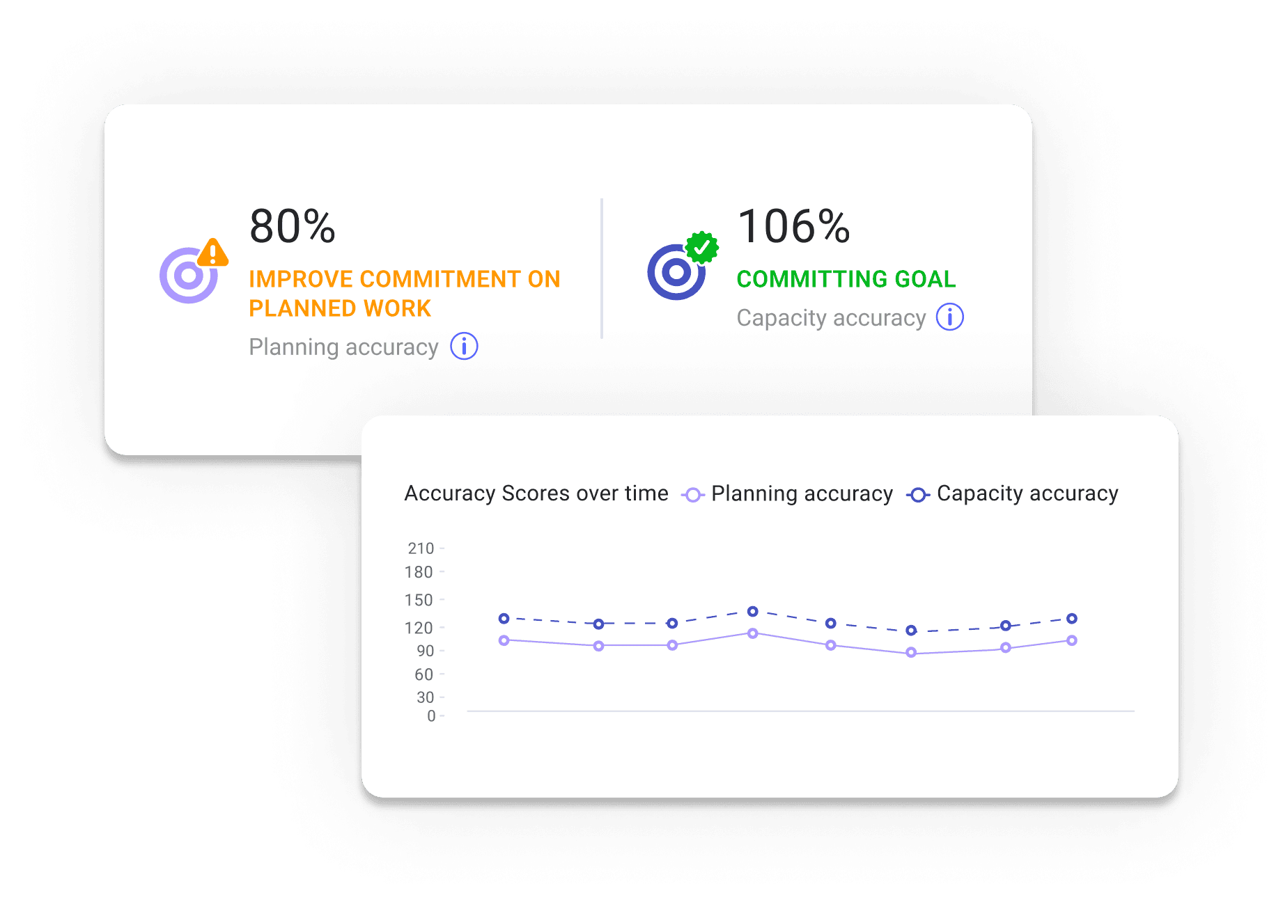
Industry research shows the average planning accuracy is below 50%, meaning engineering leaders are often wrong more than right when estimating completion timelines using traditional methods like burndown charts.
Advanced Forecasting with Monte Carlo Simulation
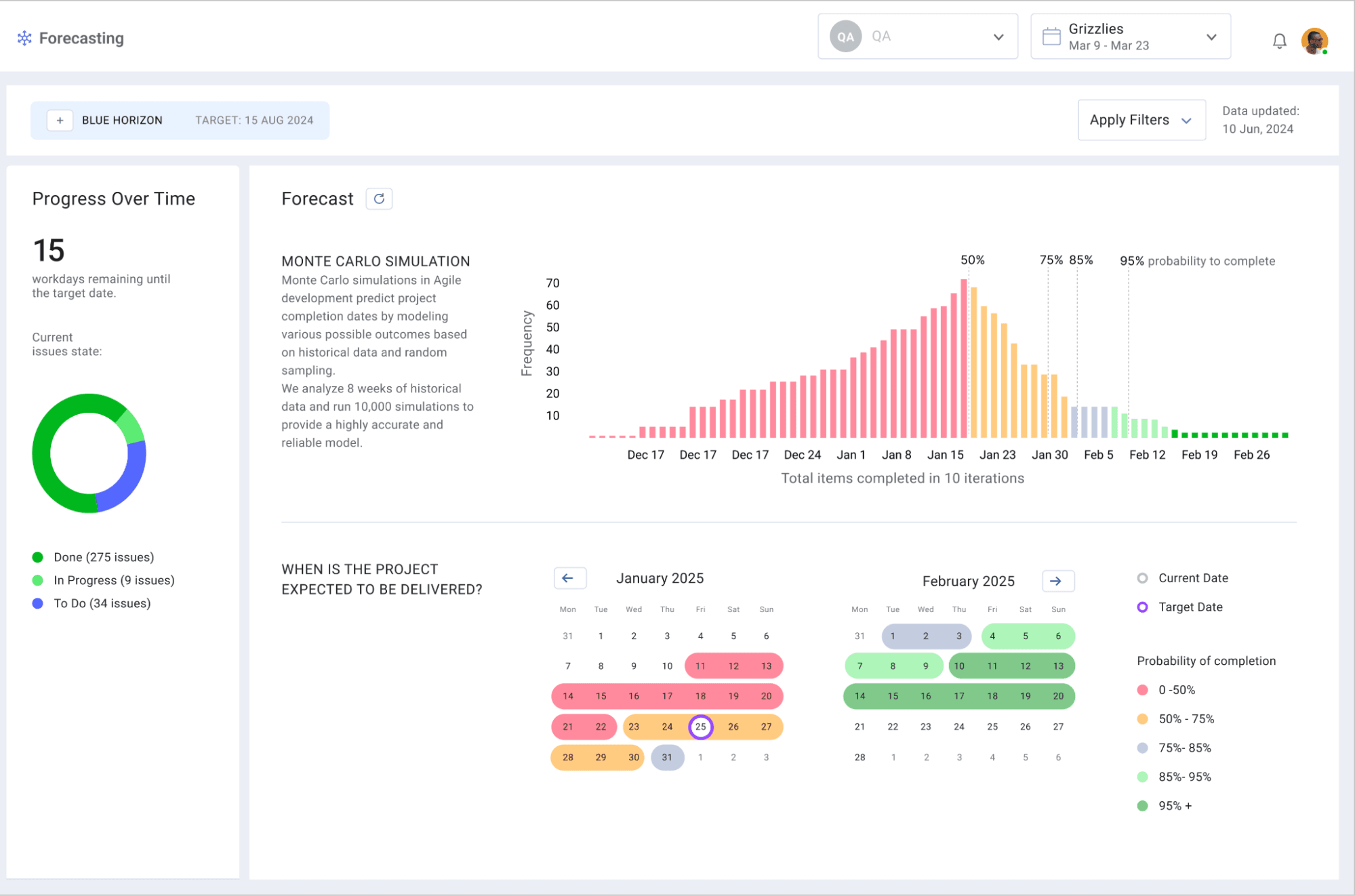
LinearB's Forecasting feature takes project tracking to the next level by applying Monte Carlo simulations to your team's historical delivery data. Unlike the simplistic projections of burndown charts, this approach:
- Runs thousands of simulations based on your team's actual performance
- Generates probability-based delivery forecasts rather than single dates
- Visualizes completion likelihood against calendar dates in multiple formats
- Provides confidence levels (50%, 75%, 85%, and 95%) for delivery milestones
This statistical approach acknowledges the inherent variability in software development and gives stakeholders more realistic expectations with clear confidence intervals rather than false precision.
How Engineering Leaders Can Modernize Project Tracking Today
Transitioning from burndown-centric tracking to more sophisticated engineering metrics requires intentional change management. Here's a practical roadmap to modernize your project tracking approach:
Step 1: Audit Your Current Metrics Landscape
Before implementing new metrics, take stock of your existing measurement systems:
- Identify where and how burndown charts are currently used
- Document which teams rely on them and for what specific purposes
- Catalog the decisions currently made based on burndown data
- Assess stakeholder dependencies on current reporting methods
This audit helps you recognize gaps in your current measurement approach while identifying opportunities to introduce more meaningful metrics without disrupting essential workflows.
Step 2: Layer in Deeper Process Signals
Rather than removing familiar tools overnight, enhance your metrics portfolio with additional signals that provide deeper visibility:
- Implement cycle time tracking across your development pipeline
- Monitor PR size and review dynamics to identify collaboration bottlenecks
- Track deployment frequency to measure actual delivery cadence
- Add code quality metrics that capture maintainability trends
These additional data points complement existing task-tracking visualizations while providing early warning signals that burndown charts miss entirely.
Step 3: Train Teams on New Metrics
For new metrics to drive improvement, teams must understand what they measure and how to influence them:
- Create brief training modules explaining each new metric's purpose and interpretation
- Connect metrics directly to team behaviors and development practices
- Establish clear ownership for each metric to drive accountability
- Develop playbooks for responding to concerning trends
Education ensures teams view metrics as actionable feedback tools rather than opaque performance assessments. When developers understand how their daily decisions affect cycle time or code quality metrics, they make more informed choices.
Step 4: Update Stakeholder Communications
Modernize how you communicate engineering progress to leadership and stakeholders:
- Develop integrated dashboards showing both completion status and process health
- Create translation layers that connect technical metrics to business outcomes
- Establish regular review cadences to discuss metric trends and improvement initiatives
- Gradually shift stakeholder expectations from task-counting to value delivery measurement
This approach maintains visibility for stakeholders while introducing more meaningful indicators of engineering effectiveness.
Want to up level your communication to business stakeholders? Download our CTO Board Deck Template →
Step 5: Build Continuous Improvement Loops
Transform metrics from passive monitoring tools into active improvement drivers:
- Establish regular retrospectives focused on metric trends
- Identify recurring patterns that affect delivery predictability
- Track experiment outcomes when teams test new approaches
- Recognize and celebrate metric improvements alongside feature deliveries
By connecting metrics to specific improvement initiatives, you create a culture where measurement directly contributes to better engineering practices.
Is your tracking system agile enough for modern engineering? Ask yourself:
- Do your metrics reveal problems before they impact delivery dates?
- Can you identify process bottlenecks in real-time?
- Do you measure both code quality and delivery speed?
- Are your metrics driving specific team improvements?
- Can you correlate engineering activities with business outcomes?
Answering "no" to any of these questions signals opportunities to enhance your measurement approach beyond basic burndown tracking.
Move Beyond Siloed Metrics to True Productivity Insights
Burndown charts played an important role in agile's evolution, but they're no longer sufficient for modern engineering orgs. The fundamental problem isn't burndown charts, but relying on isolated metrics from a single tool when your development workflow spans multiple systems. Your engineering data lives across Git repositories, CI/CD pipelines, project management tools, incident platforms, and more. When these data sources remain disconnected, you miss crucial signals that determine delivery success.
What engineering leaders need is a productivity platform that correlates data across your entire toolchain to reveal:
- How code changes connect to business initiatives
- Where process bottlenecks truly originate
- Which workflow inefficiencies impact delivery timelines
- How developer experience affects productivity and quality
This holistic approach transforms fragmented data into actionable insights that drive real improvement. Rather than reacting to stale task completion trends, you can proactively identify risks before they impact delivery, optimize team workflows based on actual engineering data, and make resource allocation decisions with confidence.
Ready to move beyond the limitations of burndown charts and see your engineering organization through a clearer lens? Book a demo with LinearB today and discover how top engineering teams are gaining unprecedented visibility into their delivery processes, identifying optimization opportunities, and consistently delivering better software on time.
FAQ: Burndown Charts and Modern Engineering Metrics
What are the four types of burndown charts?
The four main types of burndown charts you'll encounter in engineering organizations are:
- Sprint burndown charts: Track daily progress within a single sprint (typically 2-4 weeks), plotting remaining work against sprint days.
- Release burndown charts: Monitor progress across multiple sprints toward a major release, showing the bigger picture of feature completion.
- Epic burndown charts: Focus on tracking larger bodies of work (epics) that span multiple sprints, regardless of specific release timing.
- Scope-based burndown charts: Adjust for changing requirements by showing both the original scope baseline and current scope, highlighting the impact of scope changes on delivery.
Each type serves different planning horizons and stakeholder needs, but all share the same fundamental limitation of reducing complex work to simple task-counting.
What is burndown vs Gantt chart?
Burndown charts and Gantt charts represent two fundamentally different approaches to visualizing project progress. Burndown charts show how much work remains against time, focusing on completion trends rather than specific tasks. They work well in agile environments where the "what" may change but you want to track velocity toward completion.
Gantt charts display task dependencies, durations, and sequences on a timeline, visualizing both the schedule and relationships between work items. They excel in environments where task ordering is critical and dependencies determine the overall timeline. While burndown charts answer "are we on track?", Gantt charts answer "what needs to happen when?" and "how do delays impact downstream work?"
Is the burndown chart story points or hours?
Burndown charts can track either story points or hours—the choice depends on your team's estimation approach. Story points provide relative sizing based on complexity, uncertainty, and effort, making them ideal for teams focused on velocity trends rather than absolute time measurements. Hour-based tracking works better for teams that estimate in actual time and need precise resource planning.
Most mature agile teams prefer story point burndowns because they account for the varied skills of team members and focus on relative complexity rather than precise time estimates. Research shows story-point based tracking tends to be more accurate over time as teams calibrate their understanding of point values.
How to calculate story points in Agile?
Story points represent a relative measure of effort, complexity, and uncertainty in completing a user story. To calculate them effectively:
- Select a baseline story as your reference point (typically assigned 1, 2, or 3 points)
- Evaluate new stories in relation to this baseline using a modified Fibonacci sequence (1, 2, 3, 5, 8, 13, 21)
- Focus on relative sizing: "Is this story twice as complex as our baseline?" or "Is this closer to a 5 or an 8?"
- Consider all factors affecting implementation: technical complexity, unknowns, testing requirements, and cross-functional dependencies
The most effective way to assign story points is through team planning sessions where developers discuss each story and reach consensus on point values, creating a shared understanding of what each point value represents.
What is the backlog burn rate?
Backlog burn rate measures how quickly your team completes backlog items over time. It represents the average number of story points or work items your team finishes per time period (typically per day or per sprint). This metric helps forecast how long it will take to complete the remaining backlog at the current pace.
To calculate backlog burn rate, divide the total completed work by the time period:
Burn Rate = Total Completed Story Points ÷ Number of Time Units
Engineering leaders use this metric to answer critical questions like "When will we complete all planned features?" or "Do we need additional resources to meet our deadline?" A stable burn rate indicates predictable performance, while an inconsistent one signals process issues that need attention.

