Enabling a high degree of developer productivity and providing the conditions for developers to do their best work (a.k.a. Developer Experience) is a significant competitive advantage for any organization. That’s why engineering leaders emphasize and continually work to improve these measures of engineering success.
Holistic, correlated visibility and clear, actionable insights covering developer experience and productivity are foundational to that mission.
Let’s start by defining these terms:
- DevEx is the overall satisfaction and ease with which developers interact with their tools, workflows, and work environments. It’s through intuitive interfaces, supportive tooling, and positive work culture that DevEx impacts and contributes to (or detracts from) productivity.
- Developer Productivity measures developers' efficiency and effectiveness, enabling them to complete their tasks, deliver high-quality software, and allow engineering to keep promises made to the business.
What is Developer Coaching?
The latest enhancement to LinearB–the Developer Coaching Dashboard–provides critical insights that illustrate overall developer productivity and experience, enabling leaders to swiftly address identified bottlenecks, inefficiencies, and skills gaps.
This all-new dashboard also enables leaders to establish good habits and prepare discussion topics, ground team check-ins with quantifiable data, and foster more productive conversations and team coaching.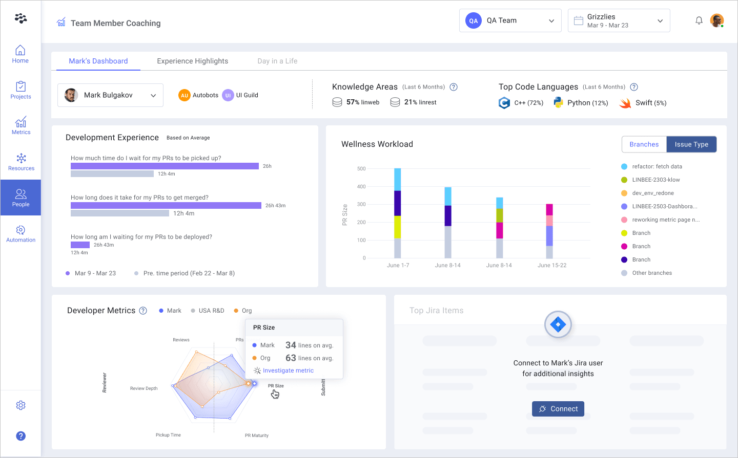
Developer Coaching data, KPIs, and metrics can also help establish better habits with teams, drive better decision-making, enable more effective performance reviews, and facilitate more productive recurring syncs and developer ceremonies.
In this blog, we’ll explore each aspect of the Developer Coaching Dashboard, show you the insight each set of metrics provides, and, most importantly, the action you can take against this insight.
Let’s dig in!
Knowledge Areas

What it highlights: This section of Developer Coaching provides at-a-glance insight into knowledge and work areas a developer has focused on over a fixed period of the last six months. This analysis shows where specific developers have concentrated their efforts–helping you balance expertise distribution and promote better collaboration across the engineering organization. Populated using Team Activity, this view presents the top three repositories a developer has worked on and requires a given area constitutes 10% of a developer's activity to display here–meaning it represents a significant investment (although this threshold is adjustable).
How to use this insight: Expertise and domain authority are good for a team, as are knowledge sharing and exposure to different parts of the code base. Use this visibility to balance teams, check in with your developers at 1:1s, and uplevel developer skills by analyzing their respective knowledge areas and:
- Expose devs to new technologies and skills
- Break the monotony of only working on one thing
- Ensure balanced workloads and mitigate chances of burnout
Top Coding Languages

What it highlights: Here, you’ll find the primary programming languages a developer uses expressed as a percentage of their code contributions in each language–visualized with their respective icons for quick identification. Like Knowledge Areas, this reflects a fixed period of the last six months.
How to use this insight: These Coding Languages values clue you into developer experience (DevEx), workload distribution, focus area, and ways to improve. With visibility into Top Coding Languages, you can see (and work to optimize):
- Expertise and Focus: A great leading indicator of skills and proficiency with different parts of your application. Make sure to facilitate knowledge sharing and ensure your resource allocation decisions will uplevel the whole team–a great way to do this is using SEI+ Automation.
- Front vs. Back End: Lots of C++ knowledge indicates experience with systems applications and infrastructure, while more Javascript contributions indicate front-end work. Spread knowledge and work types around to create redundancies for effective change management so all developers will progress.
- Adoption: Want to see if the team is following best practices and transitioning from JavaScript to TypeScript? This view is excellent for seeing how quickly and effectively new technologies are integrated so you can bring it up with the team in recurring syncs.
- Project Resourcing: Got a sensitive data project requiring expert-level R knowledge? Ensure you have the right person assigned to the job using Coding Language visibility.
Developer Experience
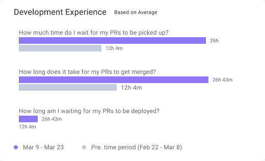
What it highlights: Developer Experience metrics on the Dev Coaching Dashboard boil down to one critical insight: toil. The metrics reflect and are responsive to the timescale you choose at the top of the page. They provide visibility into what a developer’s day-to-day looks like once a pull request (PR) is issued and compare it to the previous period (visualized in grey). These values use KPIs from the Metrics Dashboard and reflect your selected metrics calculation method.
- Pickup wait time is the time elapsed between a pull request (PR) being issued and the first comment made by a reviewer.
- Merge wait time measures the time a PR takes to merge into the main branch after approval.
- Deploy wait time is the time it takes for a PR to be deployed into production after it has been merged.
How to use this insight: High values (or values trending up as compared to the previous period) in any of these categories indicate process bottlenecks and an opportunity to improve DevEx and developer productivity. Here are the insights you can take away from each DevEx metric and how to improve them:
- High Pickup Wait Time: Lots of idle time and associated context switching. Focus is split, and quality (along with delivery timelines) will likely suffer. Here’s what you can do:
- Work to keep PRs small
- Set Team Goals against both pickup time and PR size
- Put another resource on the product to ensure things stay on track
- Use SEI+ Automation to automatically add estimated review time labels or review/approve safe changes automatically
- Learn more here
- High Merge Wait Time: Idle time and context switching can lead to a loss of focus, which can result in a high Merge Wait Time. Mitigating this risk involves tracking work effectively and keeping it top of mind. Developers can use real-time alerting in their communication and collaboration tools to keep the work moving. You can learn more here.
- High Deploy Wait Time: Something is preventing developers from shipping their code to production. The most likely culprits are lack of visibility or process alignment. Developers can use real-time alerting in their communication and collaboration tools to keep the work moving. Additionally, high deployment wait times for either individual developers or the entire organization are good opportunities to review policies and adjust things like Acceptance testing design and CI/CD policies. You can learn more here.
Developer Metrics
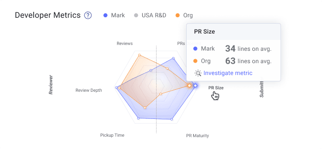
What it highlights: This widget provides a unified view of developer activity over a specified timeframe to ensure a healthy balance of code contributions and reviewing others’ work–both required for productivity and predictable software delivery. Developer metrics provide visibility into the selected developer activities, the team/group’s activity, and the organization.
How to use this insight: Use this data to identify overall trends and inform conversations about great performance that needs to be recognized or imbalances, gaps, and improvement opportunities. For all metrics areas, teams and individuals should strive to fill the outside of the graph, as proximity to the perimeter indicates teams are trending in the right direction.
That said, you know your team, their roles, and their focus areas best. The distribution will look different based on role and seniority–e.g., a junior dev will likely have more coding time and PRs opened rather than high numbers in reviews or review depth. Meanwhile, a senior developer or architect will likely be the inverse. Be sure to consider this when preparing for conversations with your team.
Reviewer
- Reviews: Shows you the number of conducted PR reviews. While junior devs may have fewer reviews and more PRs opened, they should still conduct reviews regularly to uplevel their skills. Bring this data to 1:1s and team syncs.
- Review Depth: Indicates how thoughtful and thorough a developer’s reviews are. Depth is a measure that considers both the size of PRs and the number of comments added to that PR. If there’s a regular habit of “LGTM” on 500 diff PRs, you’ve got a gap: Set Team Goals and automated alerts against this metric.
- Pickup Time: How quickly PRs are picked up after being issued (for any reviewer to pick up) or after being assigned to the developer you’re looking at. If this metric is regularly high, set a Team Goal and automated alert against it.
Submitter
- PRs Opened: The number of PRs a developer opened over the specified timeframe. The goal should be to have a steady flow of PRs, though pay attention to WIP and working days, as these are burnout indicators that should be kept at manageable levels.
- PR Size: One of the best leading indicators of efficiency, quality, and overall engineering health. Small PRs are picked up faster, reviewed more quickly, and usually benefit from thoughtful reviews–resulting in lower cycle time, higher deployment frequency, fewer issues when deployed to production, lower CFR, and reduced MTTR. Keep this number low by setting goals, using automated alerts, and bring this data to regular check-ins with the team.
- PR maturity: This metric measures the “back and forth” on PRs between the submitter and reviewer(s). Generally speaking, small PRs (<250 lines of code changes) that provide reviewers with more context up front (language, estimated review time, testing) and get assigned to the right reviewer will result in more maturity as they usually don’t require lots of handoffs. Automation will prove invaluable for increasing PR maturity.
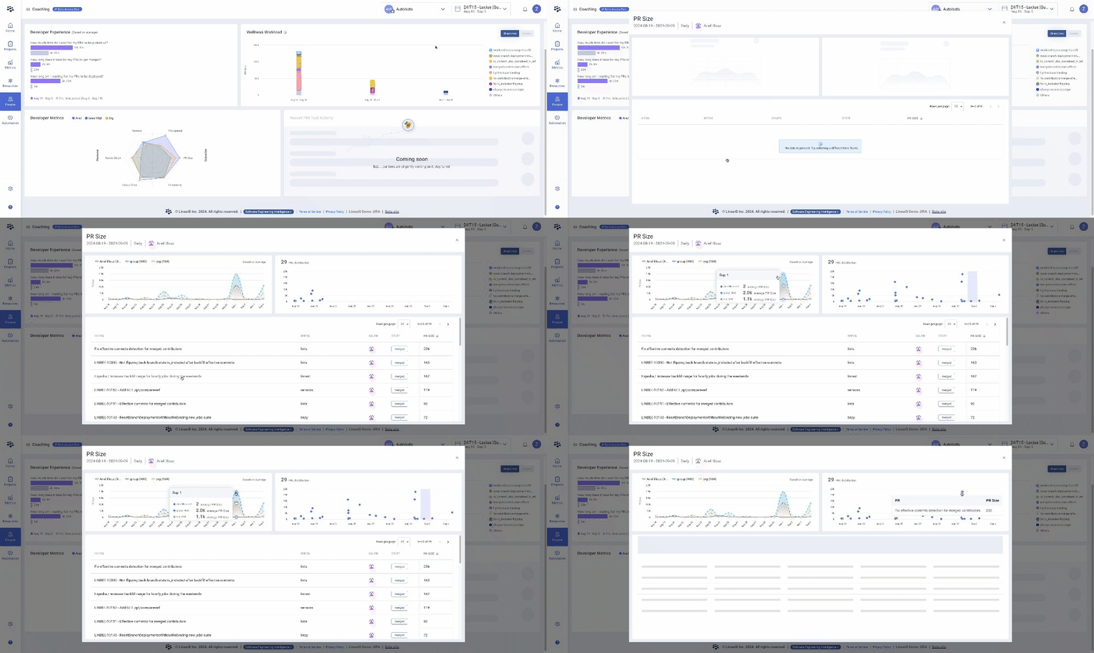
In addition to the at-a-glance metrics from the spider chart, you can investigate these metrics further and examine spikes, outliers, and overall metrics patterns with just a few clicks. This deeper visibility includes the metrics (at the individual PR level) for the developer, the team/group they're a part of, and the organization as a whole.
Wellness Workload
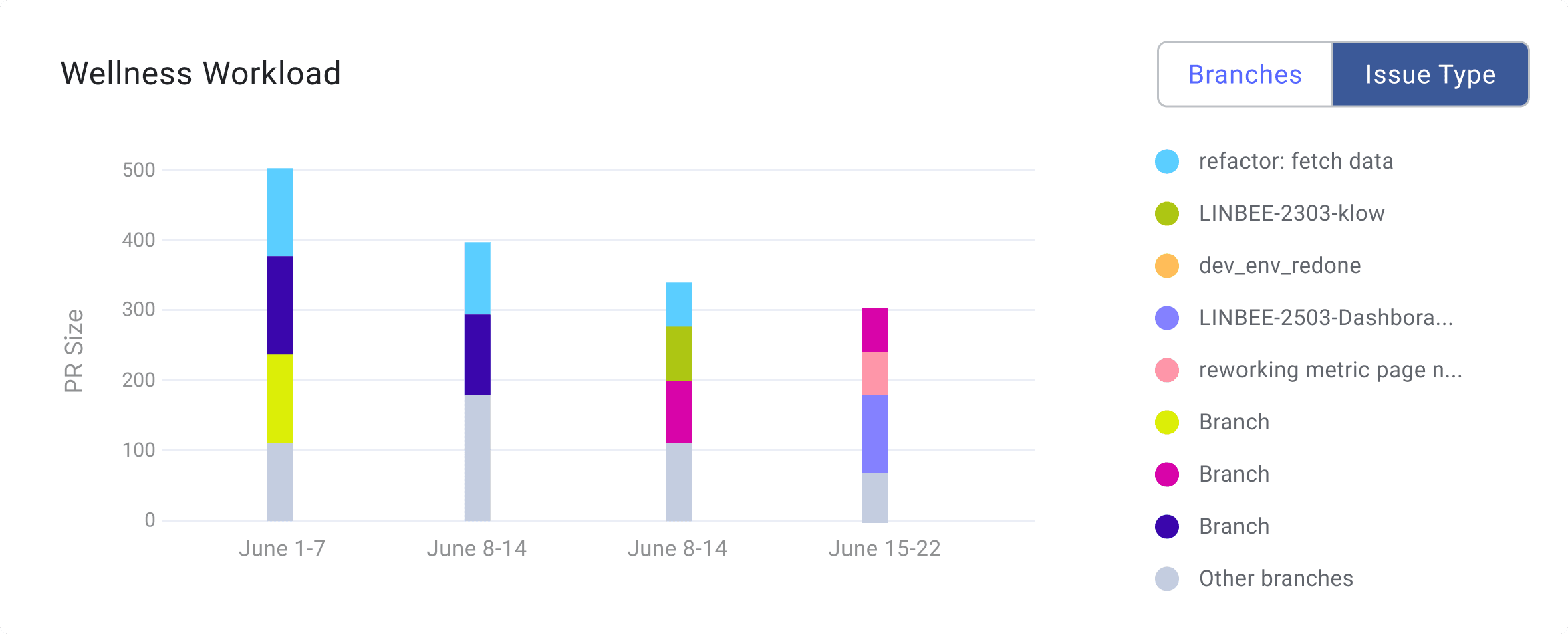
What it highlights: This view provides insight into context switches and cognitive load–critical considerations for developer productivity and great DevEx. This widget is responsive to the date selector at the top of the page, formats the graph automatically, and presents the data by branch or by issue. It offers excellent data into what a developer is working on and their ability to focus, complete work, and move on to the next task on their assignment list.
How to use this insight: Success here is when each column is limited to 2-3 different colors (indicating branches or focus area), and those different colors are contained to a single column (meaning completion and moving on to the next task). There should also be a balanced distribution of work on new features and enhancements and keeping the lights on (like bugs). Use this view with Allocation, Investment Strategy, and Delivery to ensure balanced workloads that provide a great DevEx while also fulfilling the needs of the business.
If your teams have split focus or are struggling to complete tasks, look into WIP and apply automation to help move work through the pipeline.
Next Steps
The all-new Developer Coaching Dashboard is now GA within the LinearB platform. Stay tuned for updates regarding these items as we’re focused on future innovations in this space in the near and long term.
LinearB customers can get started now and explore these great new dashboards!
For non-LinearB folks: Get the guided tour of Dev Coaching metrics today! If you’d like to jump in now, you can get a free forever account here!
We hope this new feature will help you enhance the developer experience and increase your team's productivity.


