A key reason that Agile has become one of the most popular software development methodologies today is that it helps teams measure their performance and make data-driven decisions. Among the many implementations of Agile, scrum has become the most widely-used thanks to its simplicity and effectiveness.
The release burndown chart has become a key piece of scrum projects. Most scrum coordinators (formerly known as scrum masters) are familiar with the sprint burndown chart, but in this article, you will learn about the what, why, and how of release burndown charts.
Table of Contents
- What Is a Release Burndown Chart?
- Benefits of Release Burndown Charts
- Drawbacks of Release Burndown Charts
- Conclusion
What Is a Release Burndown Chart?
The main difference between the sprint and release burndown charts is that sprint burndown tracks work toward the sprint goals, while release burndown tracks work toward the completion of a new release.
In practice pretty much everyone — product owners, scrum coordinators, project managers, engineering leads, and individual contributors — rely upon sprint burndown to monitor progress day-by-day. The release burndown chart gives you a longer term view of your team’s progress. At the end of a sprint, if your sprint burndown is showing you that you did not complete all the work you planned to, you can jump over to the release burndown chart to understand how this impacts the timeline for the larger project.
The Information Shown in Release Burndown Charts
Let’s take a look at an example from Jira:
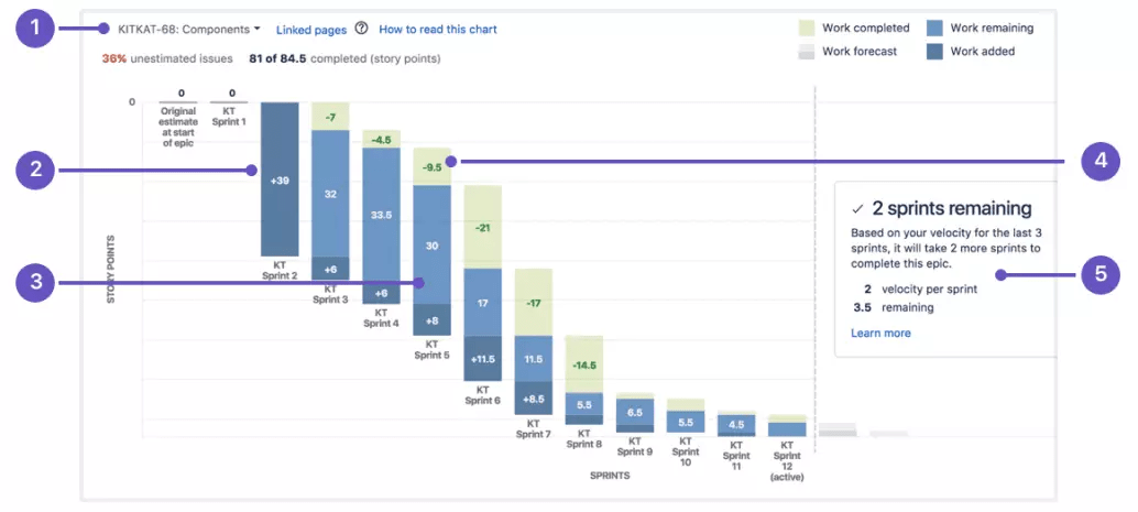
The horizontal axis shows the sprints over time. The vertical axis shows the amount of work, which is typically story points.
- This is your epic or release. Note that in Jira, they use the term “version” instead of “release” but the concept is the same.
- The dark blue bars indicate the amount of work that was added during the sprint. In an early sprint, a bunch of work will be added all at once from the product backlog. As the requirements become clearer over the next sprints, you will update the release requirements and add the necessary additional work.
- The light blue is the amount of work remaining.
- In green is the amount of work completed.
- This is Jira’s projection of how many more sprints it will take to complete all the work in the release. Keep in mind that this projection is only based on the last 3 sprints.
The final element to highlight is the percentage of unestimated issues in the upper lefthand corner. In this example, it is red because it is above 30%, which Jira considers dangerously high.
If you have a high proportion of unestimated issues in your current release/version, Jira’s projections about how many sprints until completion are going to be unreliable. Worse yet, any plans you make will be unreliable too.
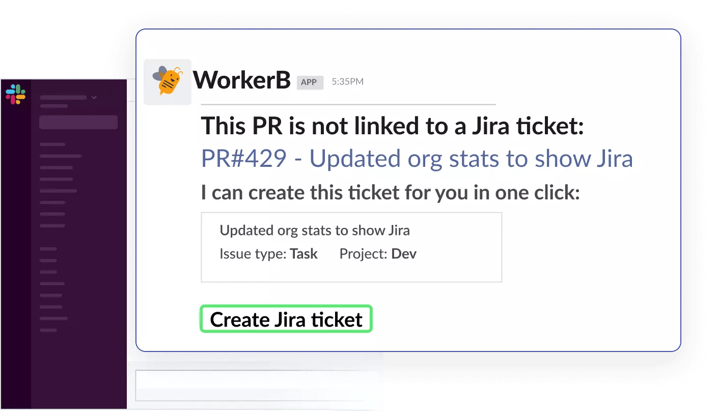
A problem even more impactful than unestimated issues is shadow work. This is development work is that unattached to any issue at all. Unestimated issues are still in Jira, and you can navigate right to them and add estimates. But shadow work can go totally undetected and unaccounted for.
LinearB analyzed over 1,000 development teams and found that in the majority of them, 31% of WIP branches are unlinked to Jira tickets. That’s why we’ve designed our WorkerB automation bot to address this. WorkerB notifies developers when one of their branches is unlinked, and with the One Click Ticket functionality, developers can create a ticket in Jira for that branch from right within Slack.
Among the teams using One Click Ticket, we’ve seen a 67% drop in unlinked branches.
By giving developers tools to achieve goals like improving data integrity, you are increasing buy-in. Chris Downard, VP of Engineering at GigSmart, talked about how at GigSmart, they work hard to get people trained up on tools and processes so that they can make meaningful contributions and feel like an integrated part of the team.
Benefits of Release Burndown Charts
- Easy visualization: Generally speaking, the larger the Agile project, the harder it is to determine your progress toward completing it. But with the release chart, you can immediately see your team’s progress and how much work is left.
- Helps you stay focused on larger goals: The release burndown chart is the most effective tool for tracking the overall progress of a release. It gives you a “bigger picture” understanding of how your team’s work in individual sprints is coming together to achieve larger goals of the business.
- Facilitates course correction: By seeing your progress over time, you can see when the scrum team is executing well and when performance dipped. This enables you to refine your processes and more consistently execute.
Drawbacks of Release Burndown Charts
Although the release burndown chart is a powerful tool, it is not without its limitations.
Doesn’t Show You What Kind of Work Was Completed
Burndown charts, whether for releases or sprints, stay high level, which makes them easy to parse but this lack of detail prevents deeper insights. The release burndown chart shows you how much work has been completed and how much is left. But these are only quantities. It doesn’t tell you what kind of what work the team completed. In other words, it only tells you how fast you’re going, not if you’re going in the right direction.
For this, you need a tool like LinearB’s Investment Profile. By taking into consideration issue type, you can see where your team is investing their time, not just how much work they completed.
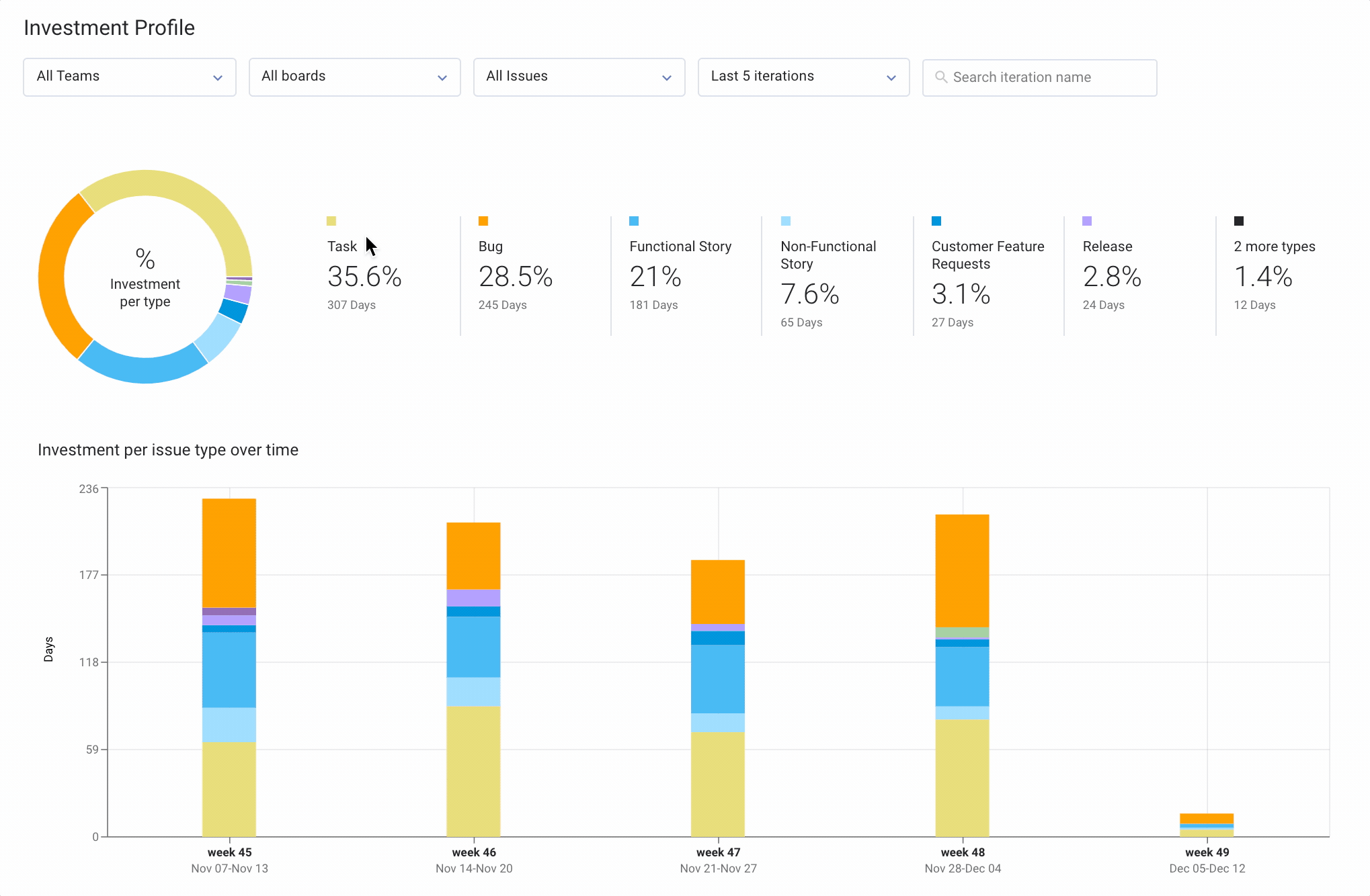
Insights like this enable you to understand what value the team has created and the factors holding them back. If they spent a lot of time shipping non-functional stories, this strongly suggests that they were paying paying off technical debt. If they spent a lot of time fixing bugs, you may have an issue with code quality that is preventing your team from spending more time shipping functional stories.
Doesn’t Show You Who Contributed
In any software project, the primary cost is people effort. The release burndown chart can show you that you completed 10 story points in a sprint, but it doesn’t tell you how much effort went into those points. In short, release burndown shows you the “benefit,” but tells you nothing about the “cost.”
The People Effort metric in LinearB’s Project Delivery Tracker fills in that information gap.
With context about who is contributing to which projects, you can decide whether the team is allocating their time most effectively. If a project is behind schedule, but only 20% of the team is contributing, then you could have more developers contribute. But if the project is already taking up a lot of the team’s bandwidth, then maybe the deadline needs to be adjusted.
Doesn’t Tell You How Accurately You’re Planning
Although the release burndown chart tries to plan for you by projecting when the release/version will be completed, it doesn’t indicate how accurately you are planning your sprints.
Planning accuracy is vital to a high-performing engineering team and a successful company. When engineering can deliver on its promises, the entire company can align around them and create reliable plans of their own.
This is why Planning Accuracy is one of the key metrics in LinearB. Not only can you track your planning accuracy across sprints, but you can compare this to industry benchmarks that LinearB created by studying almost 2,000 development teams in our groundbreaking study.
Once you evaluate how well you are planning, you can then leverage LinearB’s other metrics and tools like Investment Profile or Cycle Time breakdown to dive deeply into the data and understand why you’re not planning more accurately and where you can improve.
Conclusion
Now you know what a release burndown chart is and how it works. It is a great complement to the sprint burndown chart, enabling you to track your progress across sprints and toward the larger goals of the business.
But the release burndown chart is not a perfect tool. It’s biggest strength is also its biggest weakness. By summarizing so much information, it doesn’t give you the level of detail you need to drive improvement.
To go deeper into the data, you need a tool like LinearB. By connecting Jira and Git data, LinearB unlocks entirely new dimensions of insights into your development processes which you can wield with our Team Goals system and WorkerB automations to drive sustained improvement in your teams.
To learn about all the ways LinearB can help you deliver on your promises and deliver more features faster, get in touch to set up a demo.