Whether you’re a scrum coordinator (previously called a “Scrum master”), a product owner, or team lead looking for ways to visualize the progress of a sprint, you’ve probably come across the term “sprint burndown chart.” A sprint burndown chart lets you plan, estimate, and track your progress during a sprint, and it has become a key piece of agile software development.
In this post, we’re going to walk through the what, why, and how of a sprint burndown before discussing its limitations and how you can overcome them.
A Quick Introduction to the Sprint Burndown Chart
What Is a Sprint?
To make software projects more manageable, agile software development breaks them down into sprints or iterations, which are smaller, more attainable milestones.
A sprint usually spans a few weeks to a month, during which the agile team commits to completing specific tasks and accomplishing specific goals. There is a well-established methodology for sprints, including 5 core meetings or ceremonies, which enables teams to run them effectively.
What Is a Sprint Burndown Chart?
A sprint burndown chart is a visual summary of the sprint’s progress over time.
Much like we break a project down into sprints, we can break down a sprint into user stories and user stories into tasks. A user story represents a discrete piece of functionality for the user, and a detailed task breakdown spells out what the developers need to implement to bring that functionality to life.
The sprint burn down chart visually depicts how much has been completed (i.e. the number of story points) and the amount of work remaining. (Hold tight – we’ll look at an example of a burndown chart shortly.)
What Are the Benefits of Using a Sprint Burndown Chart?
At the simplest level, a burndown chart summarizes your progress.
It shows where you are, the total effort remaining, and how much time you have left. But that’s not all; let’s look at some other benefits:
- It’s easy to create. You can quickly build one with Microsoft Excel or a whiteboard on the wall. There are a number of platforms, like Jira, that can generate them automatically.
- It’s easy to understand: It’s a chart with two lines.
- It provides stakeholders and team members with transparency and visibility into the sprint’s status.
The burndown chart’s strength lies in its ability to simply and visually represent progress.
How Does a Sprint Burndown Chart Work?
A burndown chart is pretty easy to read and understand; it possesses the following characteristics:
- The horizontal axis represents time.
- The vertical axis represents work, typically expressed in story points.
- The ideal line shows how we want the sprint to go and serves as the plan and guideline.
- The actual line displays the true progress of the work.
Here is an example from Jira:
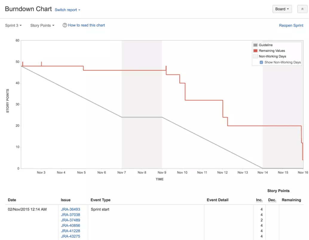
The line of ideal progress is in grey. In red is the line of actual progress. Both lines start in the upper lefthand corner and as the sprint progresses, story points are “burned down,” which gets reflected in the lines.
The sprint underlying this burndown chart was not going well for almost the entire sprint. For example, 6 days into the sprint, about 2 story points had been completed, but the plan was to complete 25 by then!
But looking all the way to the end of the sprint, we can see that very little work remains, maybe 5 story points. In the end, the team managed to achieve almost all of what they wanted to, but 2 days behind schedule.
Sprint Burndown Chart Tools
The simplest way to create a burndown chart is by drawing it on a whiteboard. A slight upgrade is doing it in Excel or a Google Sheet so that it can’t be erased.
However, these solutions are not ideal because they require manual updating on at least a daily basis. Also, they don’t make it easy to analyze burndown across sprints. Many teams rely upon an automatic solution for their burndown charts, like Jira. With just a little bit of set up, you can generate a burndown chart for each sprint that is always up-to-date, backed up, and pretty.
Even if you find the right tool to easily create burndown charts, this doesn’t solve all your problems. The burndown chart itself still has limitations. For example, it doesn’t tell you which issues and sprint goals you completed or which ones still need to be completed.
You should complement your burndown chart with a tool like LinearB. We provide the insights you need to deeply understand what is determining your burndown rate so that you can drive improvement. Let’s see how.
How To Fix Slow Burndown
It’s so common it’s almost come to be expected: Software development teams don’t accomplish what they plan to. Although this problem is ubiquitous, it doesn’t mean that it is inevitable: There are two ways to close the gap between ideal and actual burndown:
1. Increase Your Team’s Output
In terms of a burndown chart, this means making the “actual line” fall more quickly during a sprint.
There are all kinds of ways you can do this. In other posts, we’ve written about the key dimensions of developer productivity, the key metrics to track, and the 9 best tools to boost productivity.
I’ll highlight one tactic that is surprisingly effective: Reducing pull request review time. LinearB studied almost 2,000 development teams to establish benchmarks for 9 key engineering metrics.
We found that on average, it takes teams over 4 days to review a pull request! Let me underscore that – that’s 4 days that code that is almost ready to deploy, but is just sitting there, waiting. LinearB can help you speed this up and immediately speed up your overall cycle time.
 Promote your pull requests to merge 10x faster. Get started with our free-forever account today!
2. Plan More Accurately
In terms of a burndown chart, this means drawing an “ideal line” that is more aligned with reality. But higher planning accuracy has all kinds of benefits beyond just a better burndown chart, including increased team satisfaction and better cross-company alignment.
When pulling items from your product backlog to build your sprint backlog during your sprint planning meeting, you have to know two things:
If you’re planning inaccurately, this means you’re miscalculating one or both of these.
LinearB can help you plan better in a number of ways. The main one is our Planning Accuracy metric, which captures in a single number how well you are planning your sprints. By tracking this number over time, you can see whether your estimates are systematically off and whether your efforts to improve are making an impact.
Parting Thoughts
Tools are only useful to the degree that they help us accomplish our goals. The sprint burndown chart is a tool that helps scrum teams to quickly and continually know how much progress they’re making during a sprint and whether they are on track to deliver on their commitments.
But the burndown chart has its limitations, which is why you need to leverage other tools. With LinearB, you can get the insights you need to go beyond the burndown chart and understand why your burndown rate is what it is. Understanding the “why” enables you to remove bottlenecks, increase your burndown rate, plan sprints better, and deliver on your promises.