Update (March 4, 2024): Custom PM Metrics is now GA for Azure DevOps (Boards) users! LinearB users with Azure Boards can now see their velocity, quality, state transition, and delivery data in a more flexible and simplified way--no Azure Boards expertise or knowledge of Work Item Query Language (WIQL) required.
Does this sound familiar? Your team(s) just can’t hit sprint commitments no matter how hard they try. All the key project management and issue tracking metrics that matter–like planning accuracy and feature (value) delivery–are lower than historical team performance. And for some reason, features or stories that should be done keep ending up back in QA, Testing, or In-Development, which indicates a very irregular flow of these issues. All in all, an unsustainable state of affairs.
So what do you do? Attempt to figure out what’s causing the problem, of course! Standard operating procedure–however painful–is to go to your trusted source: Jira. But that comes with a whole new set of challenges: because one of the hardest aspects of leading an engineering or product team is getting the data you need out of silos into a single location and using it to make changes to your processes.

We’re excited to announce a new enhancement to LinearB that helps tackle this pervasive problem by giving leaders a way to see their velocity, quality, state transition, and delivery data in a more flexible way–all from a single, unified dashboard. Not only that, it will help leaders understand the tempo and cadence of their teams using defined parameters from their instances of Jira. And the best part of all of this is that none of this requires any sort of Jira expertise or knowledge of Jira Query Language (JQL).
Leaders of engineering and product teams rejoice!!
Exploring Custom PM Metrics
This new feature is all about engineering tempo and alignment (the T and A in the ETA of Developer Productivity). It basically shows you how efficiently teams are working and if they’re working on the things that matter.
It’s ideal for engineering and product leaders no matter if they’re leading a single team or 20 and helps them crack the code on efficiency and project investments. Really it gives them a succinct jumping off point which takes some of the sting out of double clicking into engineering performance data.
These new dashboards–accessed from the Metrics tab– really lean into LinearB’s philosophy of flexibility and aligning to how you work. Not the other way around. It also further expands upon the correlation of data points. LinearB correlates git and PM data for an accurate representation of your engineering team’s performance. Custom PM Metrics is similar in that it unifies disparate views but does so for a single data source–in this case your team(s)’ Jira instance.
You can quantify the data in two ways: by issue count (where LinearB tabulates the total number of issues that meet the defined criteria) or by story points (where it will add the story points of issues that meet criteria together)–maximum flexibility!
Then you can further filter this data by state transitions to highlight any problems with quality–taken from YOUR Jira instance, using YOUR terminology–identified by the flow of issues moving irregularly from one state to another (usually backwards into a previous state) during your selected time frame.
In addition to giving you complete freedom in how you visualize your project metrics, this new feature is all about simplifying how you surface key insights. No more searching, flipping through similar tabs, pouring over unhelpful reports, or looking up what JQL terms you need.
Here’s how it works:
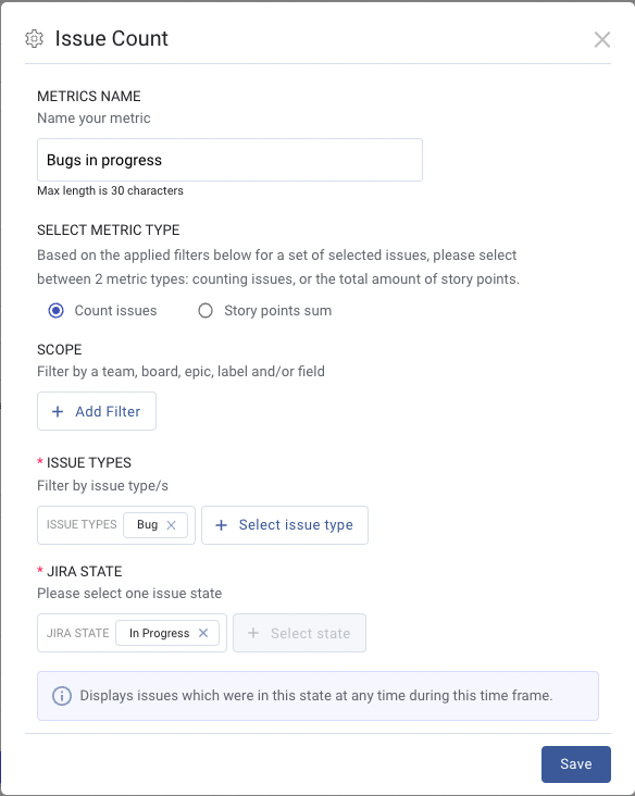
(Step 1) Users define the parameters of what they want to see in the dashboard using a comprehensive and searchable drop down pick-list menu
(Step 2) LinearB builds a consolidated view of epics, labels, boards, issue types, teams, and state transitions all within the parameters of specified states and date ranges–including any custom statuses you have in your Jira instance.
That’s it! No Jira expertise, JQL knowledge, working on multiple tabs, or manual report generation required.
“That’s great, but how is it different from my existing process?”
We’ve said it before, Jira isn’t easy. One of the most challenging aspects of using Jira is actually finding the information you need–filtered in a way that’s actually helpful. You know…the whole point behind the tool? And if you’re not well-versed with JQL (the fastest way to filter and search in Jira), this can be an involved and frustrating task.

Adding to that frustration is that the information is not usually contained on a single dashboard, meaning generating reports with data in different silos is almost a prerequisite–and really time consuming.
Let’s say you want to look into:
- Why teams are spending an increased amount of time on bugs
- Why bugs are more than 50% of this iteration’s story points
- Why the work quality is suffering–indicated by the irregular flow of issue states (regressing back) over the last two months
And what about if you want to see all of it on a single report? Sounds pretty challenging, doesn’t it? Short of Jira experts, not many people are able to (quickly) get that information in one place.
In the classic PM tools workflow, looking into team A, board B, and project C, and getting these data points all on the same dashboard requires:
- Having an idea of where to begin your search
- Running queries to find and organize the information
- Opening these queries in different tabs
- Exporting all of these data points separately
- Correlating them in a way that makes sense
- Pouring over the data to generate some kind of conclusion that you can action
And all of this is done manually. Tired yet? So are we.
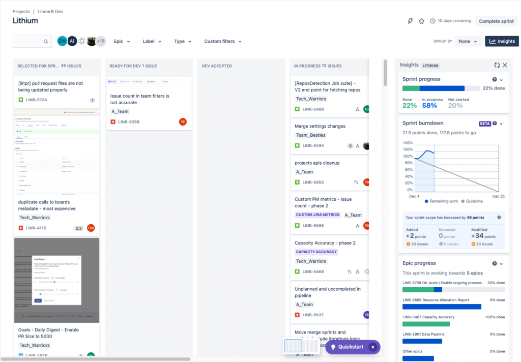
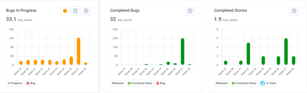
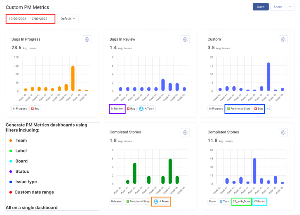
Take a look at the screenshots above. What query string would you use to find and organize work (in Story Points) that moved from “In-progress” to “In QA” back to “In-progress” from team A, board B, and epic C? And how many different screens/tabs would you need to open and flip between?
How about the report screenshot? Do any insights, patterns, or trends jump out at you? Even using the “Insights” function, the information isn’t really all that helpful. Until you begin unpacking these issues, tallying them up, and conducting comparisons to historical data, you won’t see a trend.
But LinearB’s Custom PM Metrics show you these patterns automatically!
“OK…so what do I do with this information?”
Great question! Like we said earlier, this feature is all about flexibility and simplicity when you’re trying to identify trends and find problem areas within your development pipeline to explore further. It’s also about answering questions like: “Why has the number of bugs my team is working on doubled since the last quarter?” or “What do I need to prioritize for the next sprint?” or “What portion of the work in the pipeline has a quality issue?”
With Custom PM Metrics, the answers to your toughest project questions are a few simple filters (and minutes) away–no searching, no JQL.
In short, it’s the most flexible way to see all of your Jira data in a single location.
Please note that this is an Business and Enterprise subscription feature, so if you’re on a Pro subscription, reach out to your LinearB representative about upgrading.
And if you’re not on LinearB yet, we’d love the opportunity to show you how it can help you improve your engineering teams! Reach out to get a free account (yes, you read that right) for developer teams or set up some time to see a demo. We’d love to hear from you! You can learn more about Custom PM Metrics by visiting helpdocs.