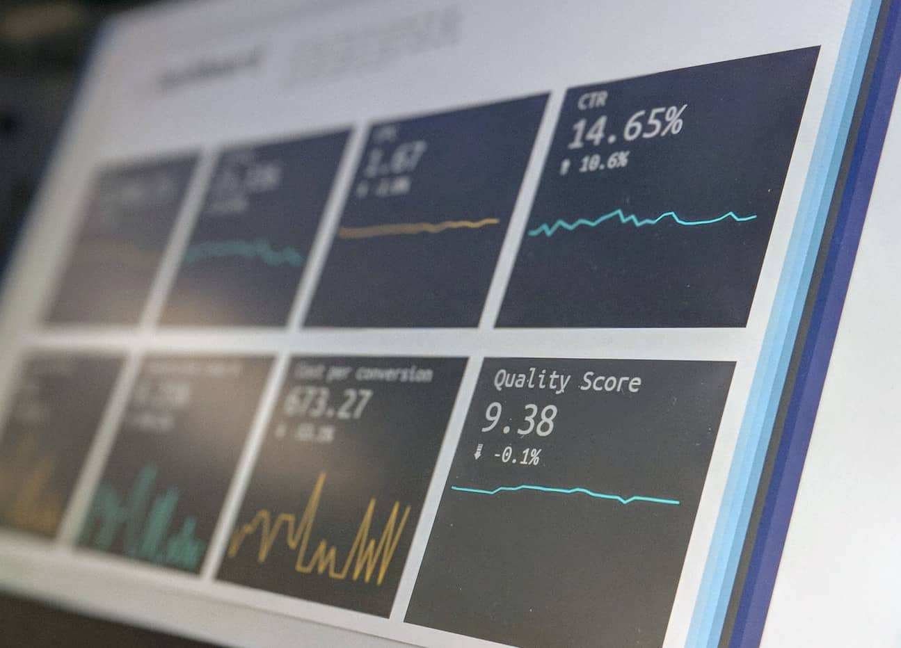
Keeping your finger on the pulse of an agile team isn’t easy. When you’re embedded with the team every day, a daily standup will help keep you up to date. We can’t say the same if you’re trying to keep up with the team from a bit more distance. When you still want to keep track of how the team’s doing without needing to sit in on a meeting every day, many teams build an agile metrics dashboard. These dashboards can be powerful tools to passively monitor the team’s health. But, it’s critical that your agile metrics dashboard deliver value and doesn’t just inundate you with more noise.
In this post, we’ll talk about what makes an excellent agile metrics dashboard and what to keep in mind if you’re seeking one for your team. We’ll also talk about three key metrics you want to make sure to measure.
Must-Haves for an Agile Metrics Dashboard
Much like any software dashboard, there are a few nonnegotiables when you start monitoring agile metrics. Dashboards that don’t meet these basic needs just aren’t very useful as dashboards. And when you build a dashboard that isn’t useful, it’s not a surprise when people don’t use it. Since you’re pushing for this metrics dashboard to happen, it’s up to you to make sure people use it. So, let’s not skimp on the key features.

Make the Big Picture Easy To See
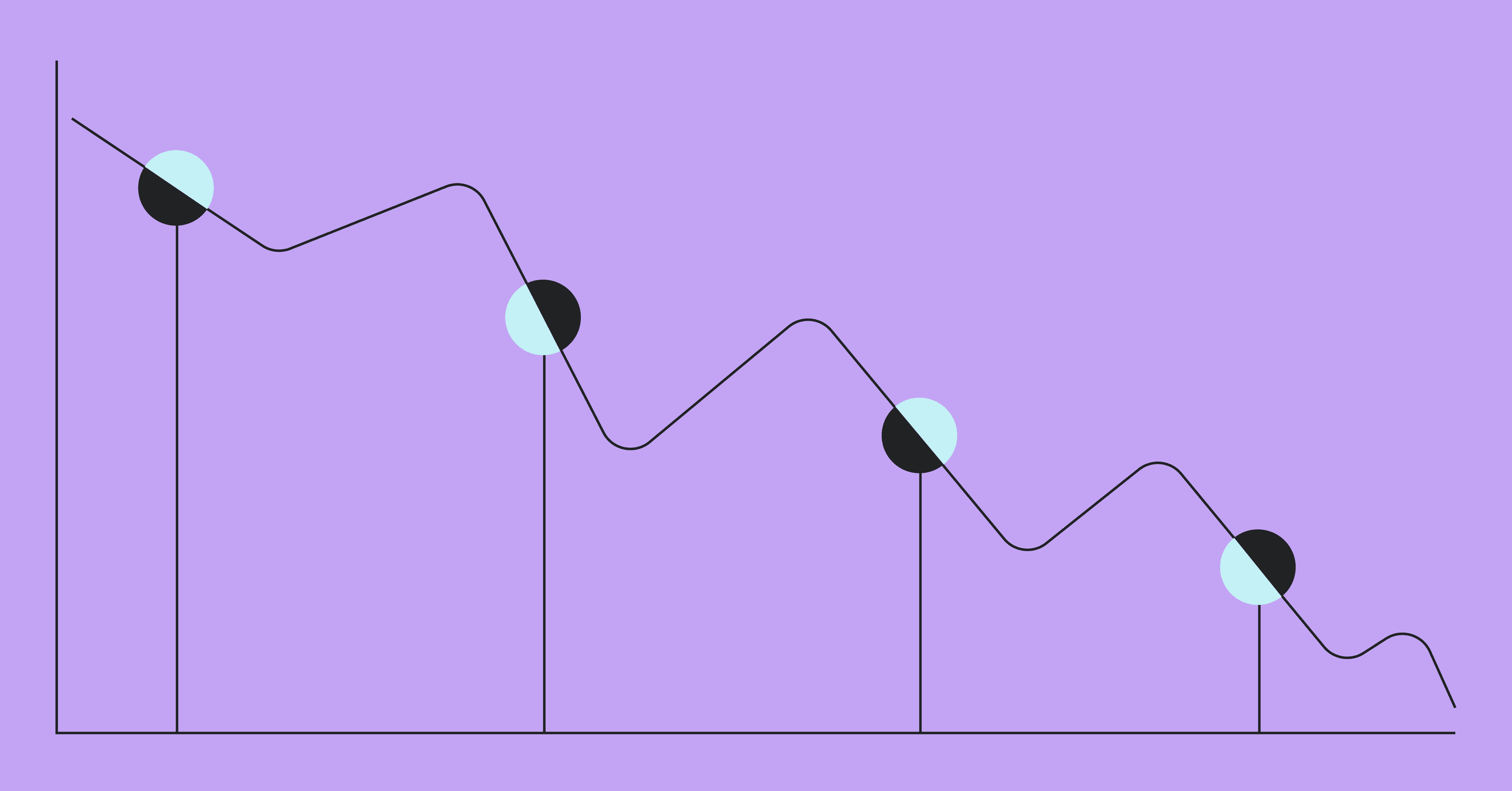
Perhaps the most popular software dashboard feature in the whole world is the burndown chart. This shouldn’t come as a surprise. The burndown chart is incredibly clear, and very simple to understand at even the most basic glance. The X-axis is time, and the Y-axis is work remaining. As you go from left to right, the work remaining goes from a lot to a little. Should your dashboard have a burndown chart? Maybe, but probably not. We’ll get into why a little later. But you should use the burndown chart as inspiration. Include metrics that are easy to understand at a glance and present them in a way so that you, and any other stakeholders who use the dashboard, can quickly understand what you’re seeing.
Often, dashboards like these are not targeted at people who are looking for nitty-gritty details. Those people are already a part of the software team or are attending the daily standups and don’t want an overhead view. Instead, your agile metrics dashboard gives you the ability to determine the health of the team at a glance.
Make Sure It’s Up To Date
I can’t tell you how many otherwise useful software dashboards I’ve seen dashed against the rocks by the fact that they’re out of date. And not just a little out of date, either. These dashboards often require three or four or even five steps of manual intervention to update data. So, those data updates only happen when someone wants to see the data on the dashboard. If you rely on a person to manually update data in a dashboard, they’ll get annoyed every time you ask. They’re not going to want to do it, and you’re going to have a hard time getting fresh data. When you don’t have fresh data, you can’t make accurate conclusions.
It’s important to stress that I don’t think all dashboards need to display real-time data. When it comes to a software team’s health, you should check in on a daily basis, not hourly or by the minute.

Make Sure You’re Tracking the Right Metrics
One of the most common flaws of software dashboards is tracking the wrong information. Imagine that you run a factory that produces widgets. You want a dashboard that shows the health of your widget-making factory at a glance, every day. Useful metrics for monitoring the widget-making factory might be the number of widgets produced per hour, the remaining resources needed for making those widgets, and the time until the next shipment of raw materials. You probably wouldn’t want to track how many minutes early or late employees clocked in that morning or how long their lunch breaks were.
Yet, this is a common mistake that executives make when identifying metrics for monitoring software teams. They fall back on easy-to-understand but poor metrics like sprint velocity to determine the health of their teams and projects. Instead, let’s talk about three metrics that are useful for a software team to monitor.
3 Useful Agile Metric Dashboard Measurements
The key to a useful metric dashboard measurement is identifying metrics that correlate with the success of your team. It’s easy to build a dashboard that uses lazy metrics. But sometimes everything looks good on the dashboard, but the team doesn’t deliver the way you’d counted on. The point of a dashboard is to avoid surprises like those! These aren’t the only metrics you should track, but they are three key ones.
Cycle Time
Cycle time is a customer-facing metric. It works as a terrific proxy to determine how satisfied your customers are with your software team’s performance. It measures how long it takes between starting to work on a ticket and actually delivering value to your customers. A lower cycle time means that you deliver value quickly. That’s obviously great for your team and for your customers.
Story-To-Bug Ratio
It’s important to fix bugs. But you don’t want to make it the only thing your team does. A team that does nothing but fix bugs does deliver some value to your customers. But they’re not delivering new value, which makes it easier for a competitor to come along and innovate their way past you. That’s how you lose business. By keeping your story-to-bug ratio high, you make sure that you’re constantly delivering great new features to your customers. This ratio serves as an effective proxy for code quality, too. If you spend less time fixing bugs (and you don’t leave a lot of bugs sitting open), you can conclude that your team is writing good software. If this ratio gets too low, you might want to invest more time in code reviews and code quality.
Code Rework
Code rework is a measurement of what percentage of recently delivered code your team is already rewriting. There are a couple of reasons code rework is a key metric. First off, if you have a high level of code rework, it means that your team is sinking too much time into short-term solutions for problems. They’re likely recognizing that something is a problem and attempting to fix it with a volatile, short-term solution. Also, high levels of code rework often correlate with high levels of developer frustration. Nobody likes rewriting code they just finished working on. If you see high levels of code rework, that probably means you need to invest more time in effectively architecting solutions and giving developers more leeway to implement forward-thinking solutions.

An Agile Metrics Dashboard can Work for You
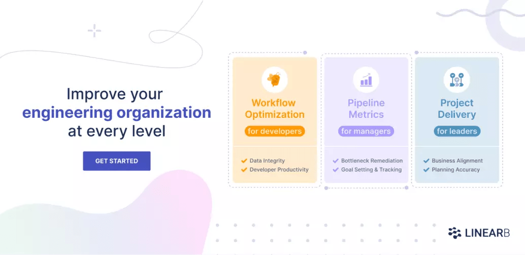
As we noted, it’s vital to have an effective agile metrics dashboard if you’re not plugged into the team every day. While it’s still no substitute for sitting in on daily standups, you don’t have that kind of time. By focusing on high-quality metrics that give you a clear view of a team’s performance, you can get nearly as much value from a much lower time investment. That investment can be even more economical if you engage a platform like LinearB to help build your dashboard for you.
LinearB’s agile metrics dashboard integrates with the tools you already use and serves high-quality metrics that help inform both developers and executives about the health of teams and projects alike. A LinearB dashboard account is free, so there’s no risk in trying it out. You could have it up and running before that next standup even starts. Is there any reason to wait?