Is your project on track to meet all communicated deadlines? Are teams working on tasks that directly align with the business goals? Can your engineering organization operate efficiently, meet goals, and maintain quality with the same resources?
These are questions that engineering leaders need answers to–and ideally the answer for all of them is yes.
To do this, you need to be able to measure every aspect of an engineering project. However, this has historically been challenging. The trick is to use engineering key performance indicators (KPIs) and metrics to ensure teams operate efficiently and align to business needs.
This article will define the engineering KPIs that you need to focus on to measure–and, more importantly, improve–software delivery predictability, team efficiency, and business alignment.
Engineering Metrics vs Engineering KPIs
People often think metrics and KPIs are the same. Although they serve similar functions, they’re used in different contexts. Just keep this in mind: every engineering KPI is a metric, but not every engineering metric is a KPI.
Many metrics can help you and your engineering managers monitor and report on your software delivery pipeline. They’re valuable for day-to-day management, but they aren’t what executives necessarily care about. Case in point, looking into how many code commits a team did over a day may be helpful to gauge how an iteration is going. But all an executive team wants to know is if that metric will impact the date of a key deliverable.
You need to narrow down your metrics to engineering KPIs that communicate how well your engineering organization is achieving defined business objectives. These KPIs should measure things that the rest of the business cares most about:
- Are devs and teams able to do their jobs and execute?
- Is engineering moving quickly with high quality?
- Are the projects being worked on providing business value?
Types of Engineering KPIs
When evaluating your teams’ progress or performance, you can use several types of KPI. Here are the different categories of engineering KPIs and some examples:
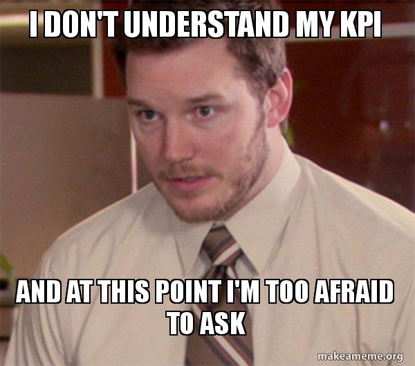
KPIs can be confusing and easily lead you astray if you don’t look at the full picture.
Source: Makeameme
Quantitative Indicators
Quantitative metrics are a straightforward method to evaluate performance. They’re represented by continuous or discrete numbers, such as whole numbers, percentages, and ratios. Examples in engineering include DORA metrics like lead time for changes.
That said, qualitative measures should be used in concert with regular check-ins and conversations with your teams.
Qualitative Indicators
These indicators aren’t expressed numerically but through feelings or opinions. Qualitative data evaluates performance through feedback. For example, employee retention, developer experience, and the employee net promoter score (eNPS) are all qualitative indicators. Remember though, surveys and feedback should be tempered with quantitative data as personal bias or feelings on a given day can skew results.
A combined approach that uses metrics visibility to temper qualitative measures always best.
Leading Indicators
Leading indicators are metrics that can help spot trends over the long term and potentially forecast a project’s future success or failure. So let’s say you’ve introduced a new service or product, you’ll use leading indicators to try to predict how successful the venture will be. Examples include PR size and PR review depth.
Lagging Indicators
Lagging indicators like cycle time, deployment frequency, and change failure rate (CFR) enable you to assess the success or failure of an action after it has already taken place.
DORA metrics are great examples of lagging indicators.
These metrics measure past performance or examine the effects of a management decision. Lagging indicators only show what has already happened, so all you can do is work to improve them for the future.
Input Indicators
Input indicators assess the number of resources required for a project or process. They’re especially important for large projects with many moving pieces, but projects of any size can benefit from them. Resource and people effort are two examples of input indicators in software engineering.
Process Indicators
Process indicators enable you to monitor the health of a process and help implement any necessary adjustments. Some typical process indicators for development teams include merge frequency and mean time to restore (MTTR). A great way to optimize process indicators is by using programmable workflows.
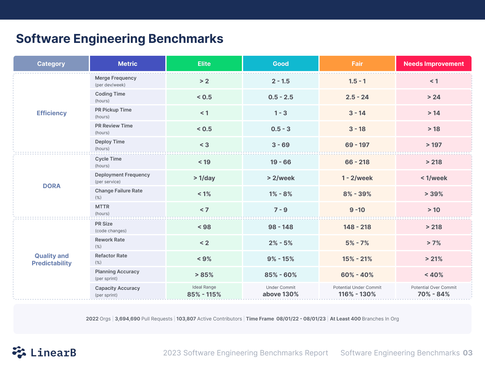
Top 13 KPIs for Engineering Teams
Since each organization has unique goals and objectives, the 12 KPIs listed below aren’t set in stone. But these engineering KPIs cover various software development metrics related to managing people, processes, and projects. They also provide a good foundation for an engineering metrics program.
1. Lead Time for Changes
This quantitative DORA metric measures the time from when a user story is ready to be implemented to when it’s ready for delivery. This time can also include discussions about the user story, how long it was waiting in the backlog, and how much time it took the story to move from pickup to release.
If your lead time for changes is too high, it’s a clear sign of a roadblock somewhere in your processes that can have a downstream effect on project delivery. Ideally, you want to keep your lead time low, as it shows your teams are quick to adapt to feedback and deliver on time.
2. Deployment Frequency
Deployment frequency tracks how often your teams deploy code to production. This lagging indicator is a good measure of the value your engineering teams can deliver to customers. However well-oiled your workflow may be, it can fail to deliver sufficient value if you’re not deploying frequently enough.
High deployment frequency shows that your team can make frequent changes to code and push them live — with little fuss and delays. The best teams deploy multiple times per day or on-demand. Good deployment frequency means that teams have adopted continuous integration and continuous delivery (CI/CD) practices, have small PRs (more on this later), and don’t get bogged down with things like deprecated dependencies or infrastructure problems.
3. Change Failure Rate (CFR)
Change failure rate measures the percentage of failed deployments to production. This lagging indicator can give you a clear view of software quality and stability. To calculate it, determine the number of deployments that caused failures, and divide it by the total number of deployments.
By monitoring this metric over time, you can get a good idea of how much effort goes into addressing problems and how much goes into releasing new code. When it’s above 15%, there’s likely a larger pattern of quality issues at play stemming from large PRs or best practices not being adhered to.
4. Mean Time to Recover/Restore (MTTR)
Mean time to recover is another lagging indicator that shows you how quickly a service can resume normal operation after an interruption. To determine this KPI, calculate how long it takes to deploy a patch after an issue is reported.
Even the best DevOps teams experience unanticipated downtime. You can’t stop failures from happening — but you need to know how long it takes to get things back up and running after they do.
When your company’s recovery period is short, it’s indicative that processes are good, and your teams produce high quality code that’s well organized and easy to parse for errors. This engineering metric is crucial because it motivates developers to create more reliable systems.
5. Cycle Time
Cycle time is a lagging indicator that can give you clear insight into a team’s productivity in software development. Cycle time measures the amount of time from the first commit to release to production. In other words, it measures how quickly an engineering team delivers features to the customer. A short cycle time is ideal for any development team.
Lower cycle times result in greater efficiency (which means more regular value delivery and profitability). When development managers keep an eye on cycle time, they can see any potential snags in the delivery process before they become major delays.
This is one of the best engineering KPIs for communicating efficiency and tempo to the rest of the business.
6. Pull Request (PR) Size
PR size is a measure of the total number of lines of code modified in a pull request. Developers are less likely to introduce errors or bugs when pull requests are small and easy to understand, making this process indicator easy to implement.
And what happens when you reduce pull request size? They become simpler to test and evaluate, allowing team members to provide more extensive feedback more quickly–resulting in fewer bugs and higher quality.
Smaller PRs are also picked up more quickly because they take less time to review.
Ideally, PRs shouldn’t take more than a single session to review and merge. When your teams’ PRs contain hundreds or even thousands of lines of code, it should be a major red flag — they’re too big and you need to break them up.
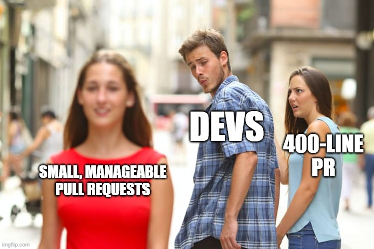
Make sure all your PRs are attractive, keep an eye on PR size!
Source: Created using imgflip
7. Review Depth
To spot and fix quality concerns, you must review the code before merging or deploying it. This process indicator provides insight into the standard of reviews and their level of detail. PR review depth is measured by the average amount of comments added to each pull request review.
To determine this metric, take the total amount of comments on PRs made during the iteration and divide it by the total PRs made. Shallow review depth (too few comments) may indicate your teams have gotten too comfortable with “seems good” feedback–common for teams that produce large PRs. Deep reviews–though usually a good thing–may indicate a systemic code quality issue.
8. Merge Frequency
Merge frequency is a top-level developer experience metric that makes a big impact on developer satisfaction and retention–merging devs are happy devs. Merge frequency is a process indicator that measures the number of PRs or merge requests a team merges during a given timeframe.
Since merges are usually the bottleneck where pull requests get stuck, they significantly affect overall cycle time. A high merge frequency shows that team members communicate well and are eager to provide constructive feedback on one another’s work. When you improve this metric, customers will receive value faster, and you’ll ensure a good developer experience.
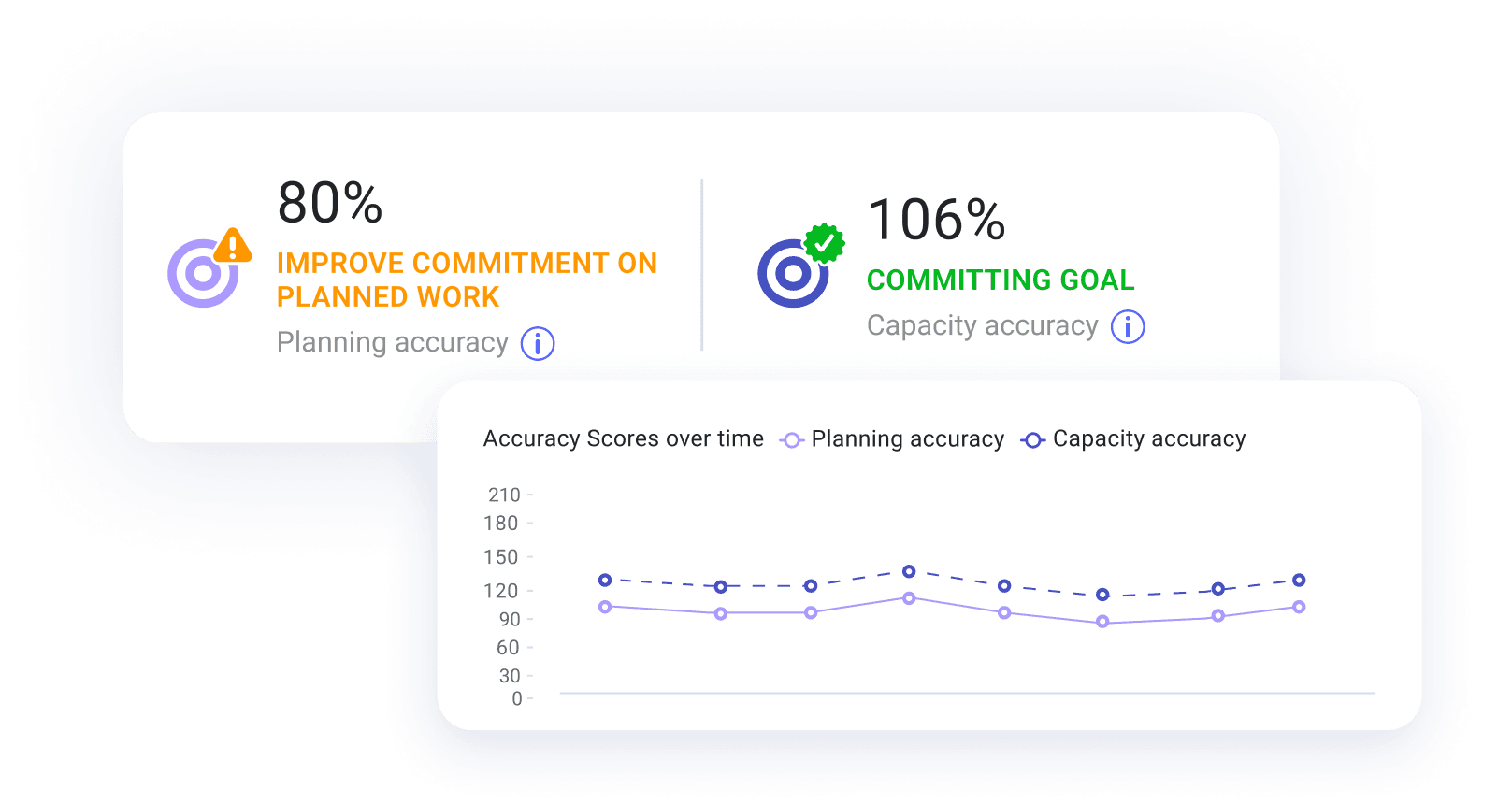
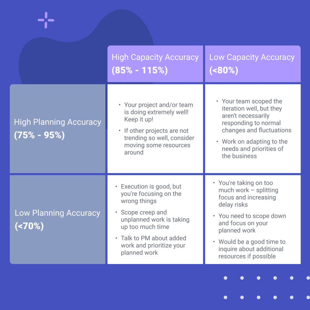
9. Planning Accuracy
Planning accuracy is the ratio of planned and completed issues or story points out of the total issues or story points planned for the iteration. Planning accuracy is a top-level metric that helps you reflect on your roadmap delivery and provides a great leading indicator of project delivery.
This process indicator provides a snapshot of project trends, allowing teams to more accurately gauge their abilities, set realistic goals, and forecast whether or not they’ll meet their commitments.
LinearB studied over 2,000 teams in our Engineering Metrics Benchmarks study and found that accuracy in sprint planning was below 50% on average. This means promised delivery dates are usually not met.
But LinearB helps you correlate data from all of your platforms, so you can pinpoint problems that could delay delivery time — namely unplanned engineering work or tasks carried over from a previous iteration.
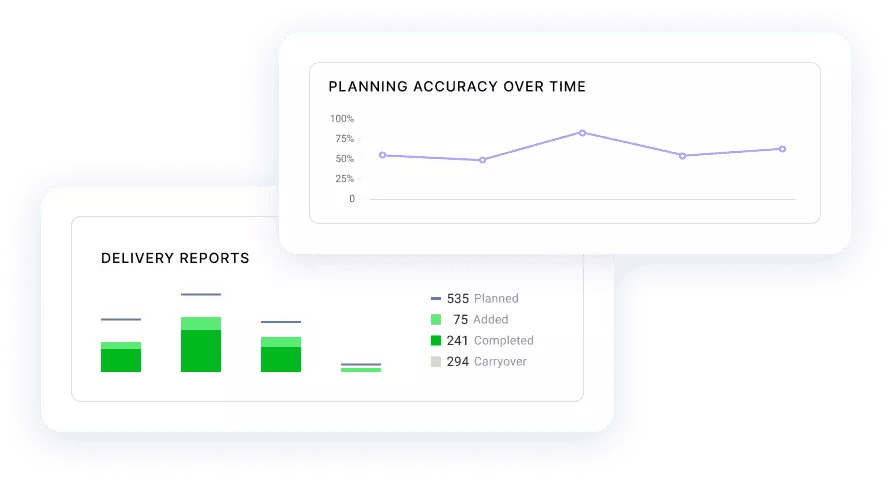
Using LinearB’s Using LinearB’s Project Delivery Tracker can help you visualize unplanned work your team is doing each sprint and improve your planning accuracy. Book a demo today!
10. Capacity Accuracy
Similar to Planning Accuracy, Capacity Accuracy provides a look into a teams ability to scope, plan, and execute. The difference is the Capacity Accuracy also provides visibility into a team’s ability to adapt to the changing needs of the business by measuring all completed work (both planned and unplanned) as a ratio of planned work.
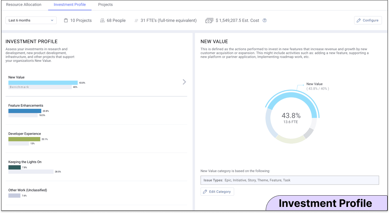
11. Investment Profile
An investment profile will help you know whether your engineering teams are putting their time and energy into the right types of tasks. You need to know how much resources your teams spent on each issue category, and this input indicator shows exactly that.
Investment profile gives you a visual idea of the time spent on new value versus fixes vs infrastructure work. And this helps you know where your effort is going and if it’s in line with industry benchmarks and what the business needs.
When developers place all their attention on completing user stories but ignore the infrastructure behind them or security, code quality suffers, and rework will be more likely. This makes it harder for your teams to fix bugs in subsequent cycles and meet future deadlines for new features as the effect compounds.
Similarly, if a team doesn’t invest enough in Feature Enhancements, usability will suffer–which can lead to problems with long-term retention–and ultimately negatively impact the business.
12. People Effort
People effort is an input indicator that measures the number of people invested in a project over time. Three values are relevant to people effort:
- Percentage of team members contributing to the project out of all the people currently working on projects
- Users contributing to the project over the relevant timespan
- Total number of people contributing to the project in each iteration
You must keep tabs on how much time and effort employees put into software projects. That way you can reassure stakeholders that resources and team focus are going into high-priority, high-impact projects. You can build reporting for business stakeholders quickly by using this template and plugging in your data.
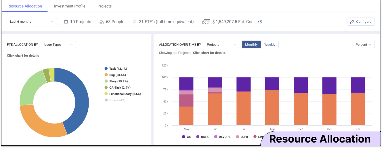
13. Resource Allocation
With the help of resource allocation, you can see how much of your team is dedicated to a project. This input indicator will help you ground discussions of your teams’ capacity in hard data.
The following factors are crucial when gauging resource allocation:
- Which developers have put in work on the project during the given period
- How many people were involved in the project during each cycle
Executives will appreciate this metric since it clearly demonstrates whether engineers are focusing on the company’s most crucial goals. Resource allocation, like the investment profile, offers the foundation for productive conversations about balancing several objectives with a fixed amount of resources.
How to Build a Custom Engineering KPI Dashboard
Keeping tabs on your engineering KPIs can be overwhelming. And time is a resource most engineering leaders simply don’t have. This is where building a custom engineering KPI dashboard with LinearB can help.
LinearB correlates data from your Git, project, release, and incident management tools to give you a consolidated executive dashboard for engineering KPIs. This way you get the metrics you need to make your next check-in more productive.