DORA Metrics Were a Great Start
In 2014 the DevOps Research and Assessment (DORA) team published their first State of DevOps report, identifying four metrics that can be used to measure engineering team performance.
The Data Science Team at LinearB decided to continue where DORA left off, digging deeper into the data than ever before. For the first time in history, engineering teams are able to benchmark their performance against data-backed industry standards.
Our study analyzed:
- 6,100,000+ Pull Requests
- 3,000+ engineering organizations
- From 32 countries all over the world
The Software Engineering Benchmarks Report was created from that study to provide engineering teams with a baseline and guidepost as they work to deliver both operational excellence and improved business outcomes.
Gathering data and benchmarking your organization’s performance against these metrics is a great first step in your improvement journey because it provides a way to understand the efficiency and effectiveness of your engineering operation.
If you'd like to see your data and how your team stacks up against these 21 metrics you can get a free account of LinearB. The platform correlates git metrics, project management data, and incident/issue management data via REST API–in addition to business alignment metrics and automation tools like gitStream–to provide the most accurate picture possible of your team’s performance and drive improvement.
In this blog, we'll deep dive into how we calculated each metric, why we made the choices we did, what each metric means, and how each metric can be used to improve your engineering organization.
Calculating Engineering Metric Benchmarks
While the DORA Metrics and Accelerate book are based on interviews and assessments, the Engineering Metrics Benchmarks Report uses data from thousands of working dev teams, of all shapes and sizes worldwide. We sourced the data from both free and paid users of the LinearB platform. The data sets are diverse and a good representation of how engineering teams work in the real world.
When we began our study, we had to decide on what data was best suited to provide us with trusted results. So we started by outlining our methodology:
- We will not omit statistical outliers
- We will only measure Merged PRs
- Will only include organizations with at least 400 branches
- We will only include organizations that had 270 days worth of data
- We will exclude draft PRs and excluded branches from our calculation
With these rules applied, we crunched the numbers, applied the metrics that fell in the 75th percentile, and began plotting them on a graph. Once this was done, we were able to take the percentiles that would turn into our benchmarks.
- Elite – Top 10%
- Strong – Top 30%
- Fair – Top 60%
- Needs Focus – Bottom 40%
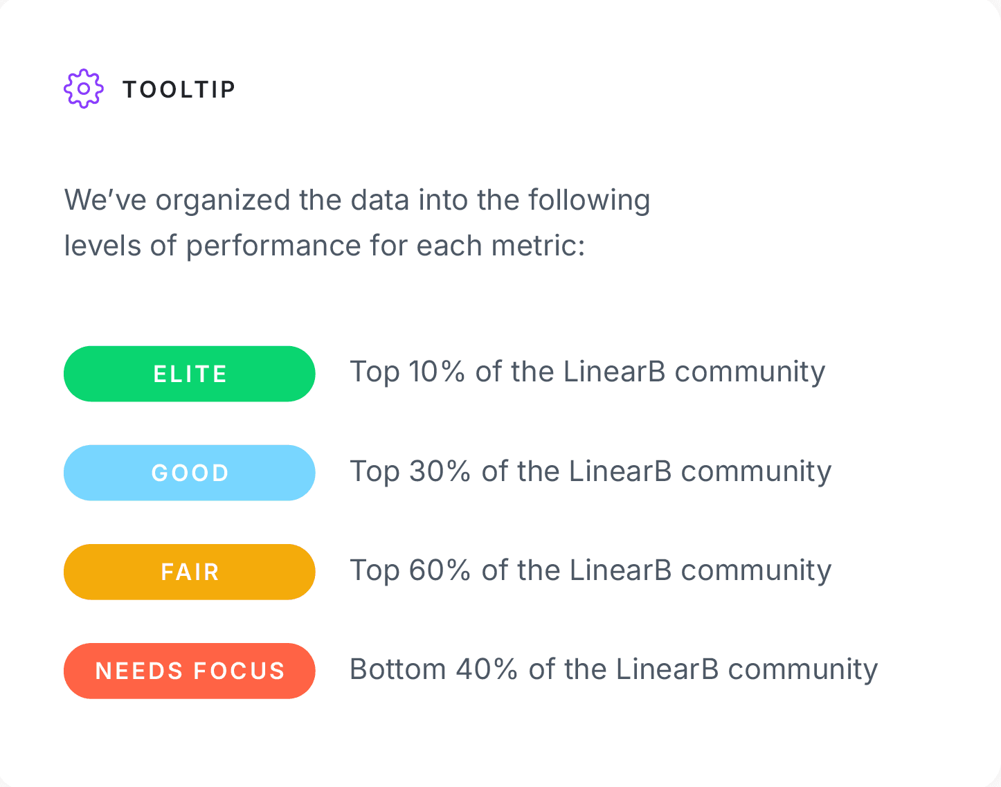
Why did we use these percentiles? It was a question we struggled with during the study. Why not make Elite the top 20% and make everyone feel a bit better about their performance? Should we make Fair and Strong a little bit larger so more organizations land in the middle of the chart?
At the end of the day, we wanted to represent what we felt was most true to the spirit of the data. In this regard, that meant Elite should be truly special. And any metric that falls into the last forty percent is an opportunity for organizations to explore how it can be improved.
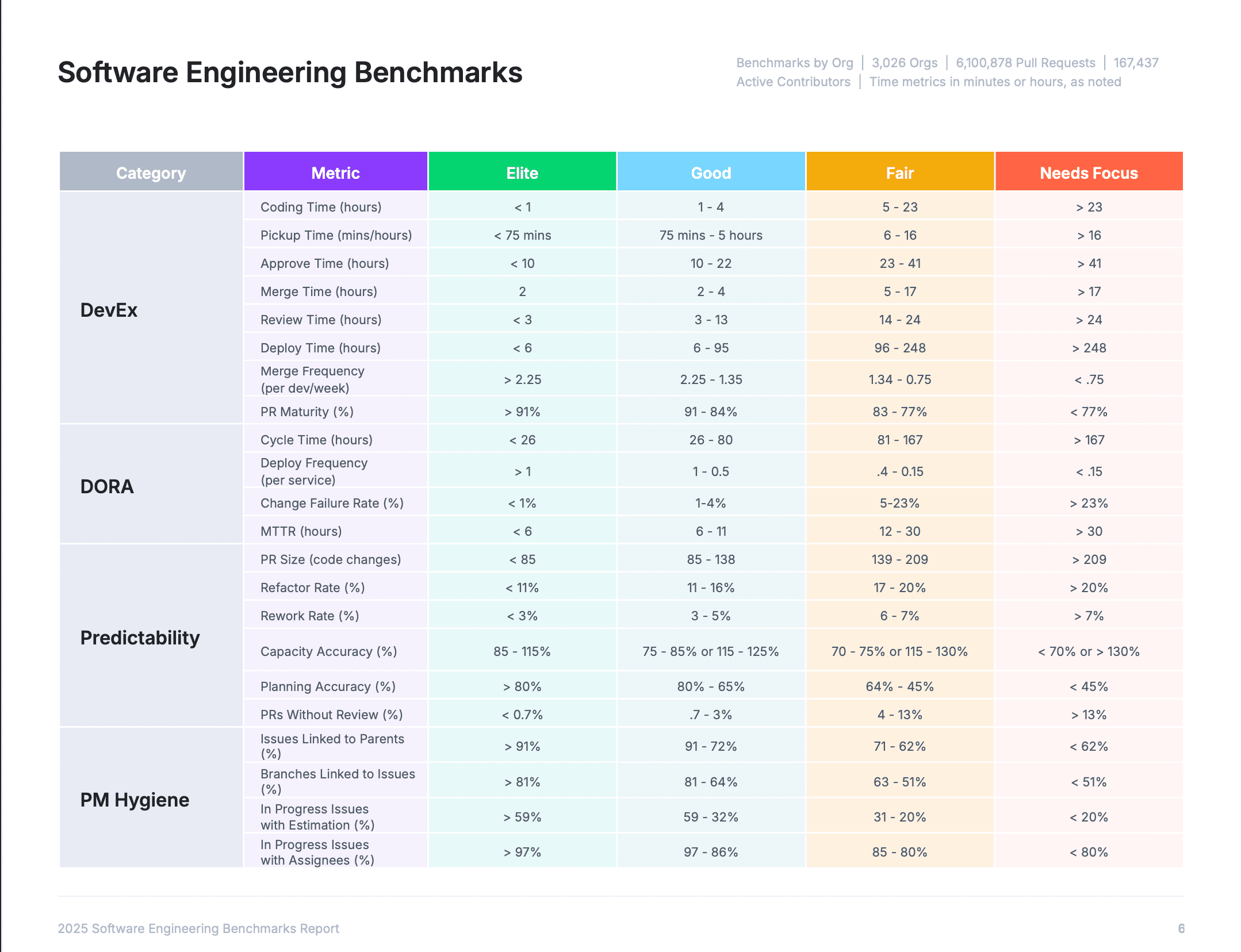
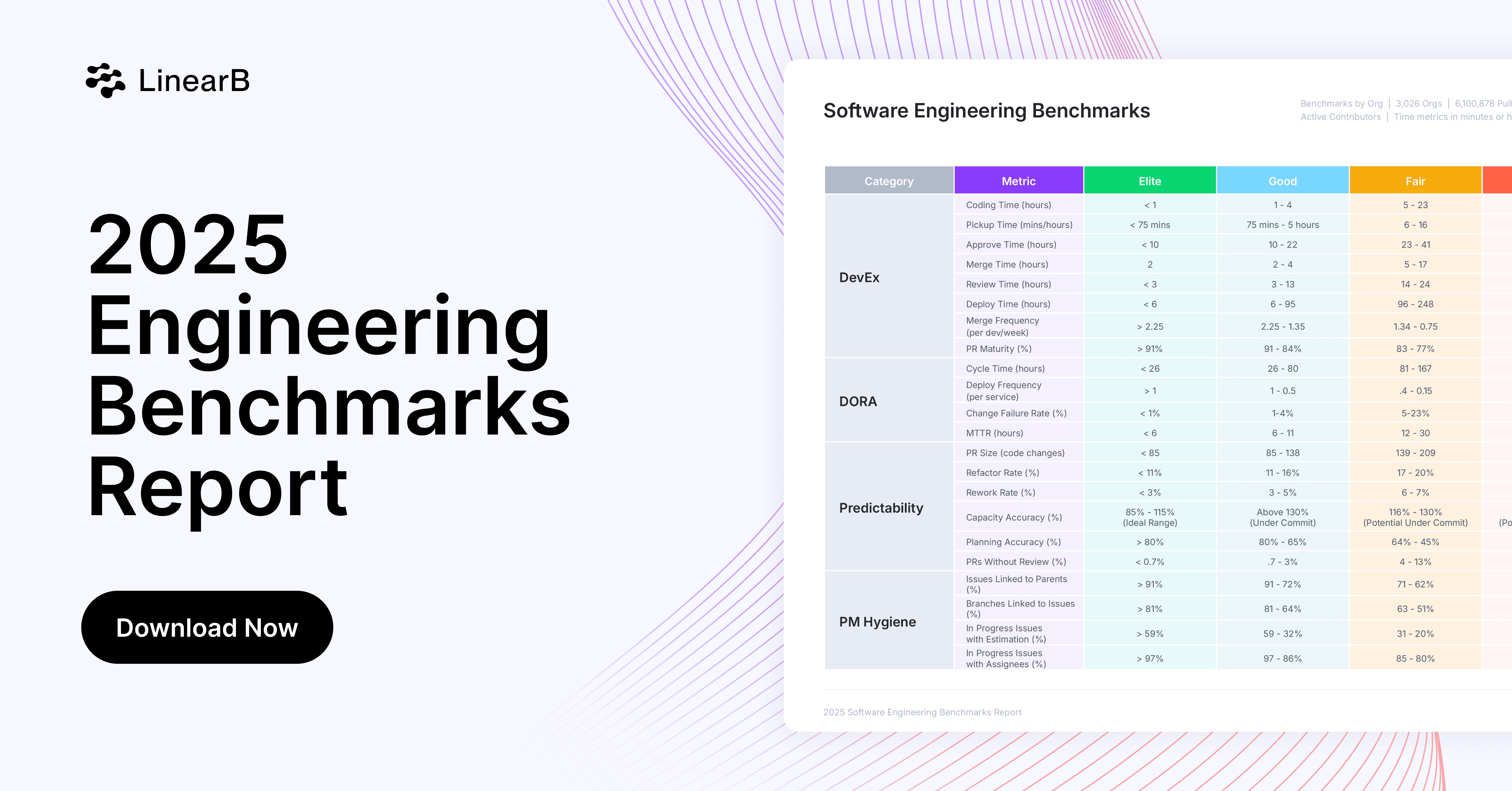
Engineering Metrics
The 21 metrics shown in the chart are all indicators of an engineering organization’s level of quality, efficiency, and delivery predictability. Teams who use these metrics benchmarks to identify areas for focus, set goals, and take steps to improve, significantly increase their operational effectiveness–a strong foundation for engineering to drive better business outcomes.
We’ve divided these metrics into three categories that encompass three core areas that engineering teams need to focus on in order to be effective.
Here’s the breakdown of the categories, the metrics in each category, and what they all mean:
DevEx Metrics
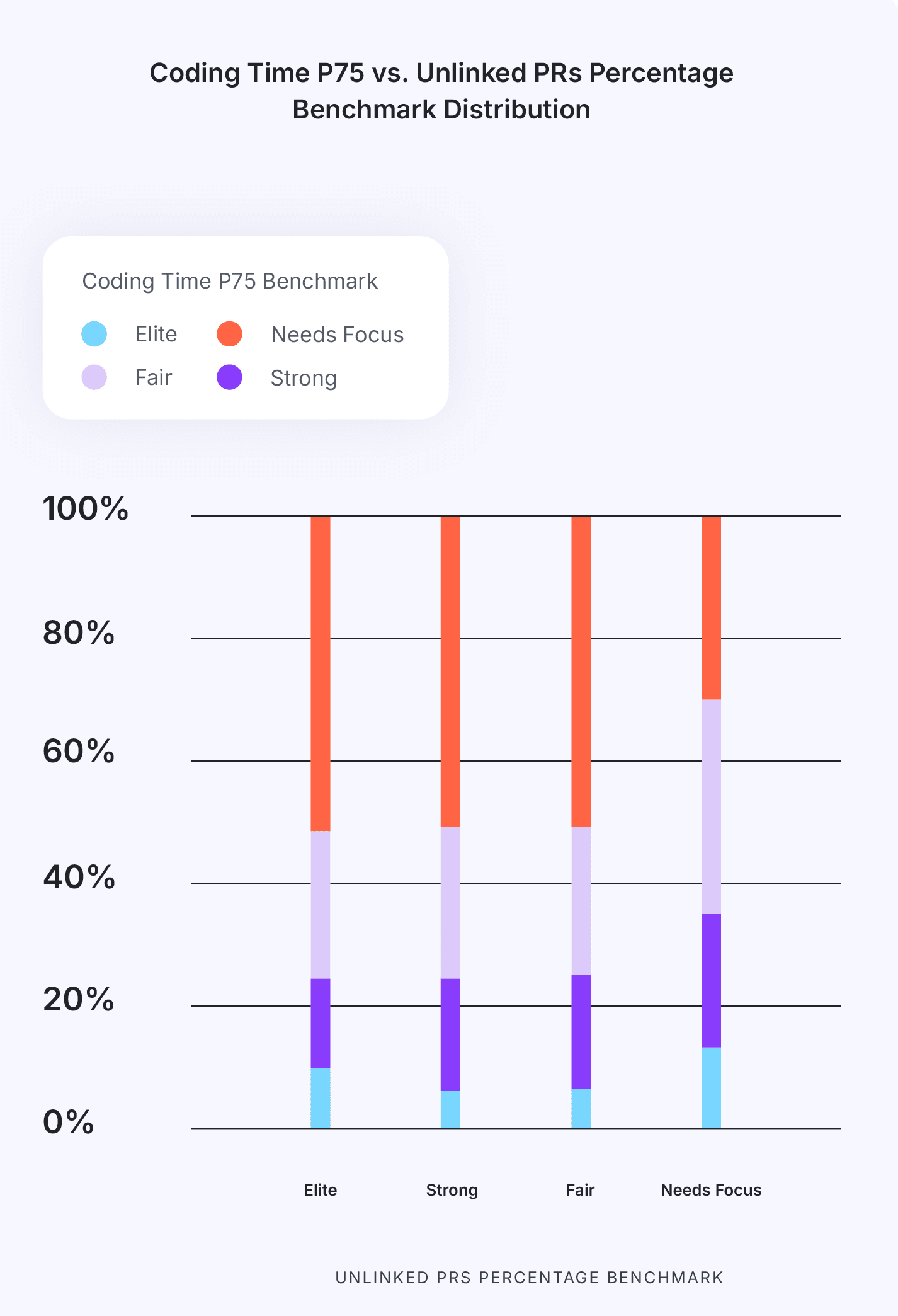
- Coding Time: Measures the time it takes from the first commit until a pull request is issued.
- Short Coding Time correlates to low WIP, small PR size and clear requirements. Combined, these benefits mean a reduction in developer context switching costs (i.e. time spent re-focusing on a task).
- Long Coding Time correlates to larger PR sizes, longer PR review times and a reduction in code quality. When requirements are unclear or work isn’t broken down into small chunks, code becomes more complex and more challenging to review thoroughly before production.
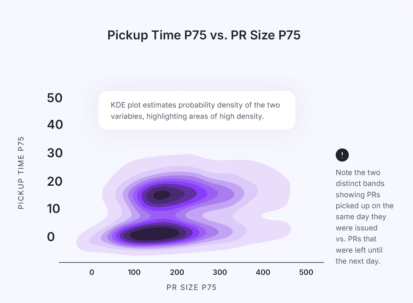
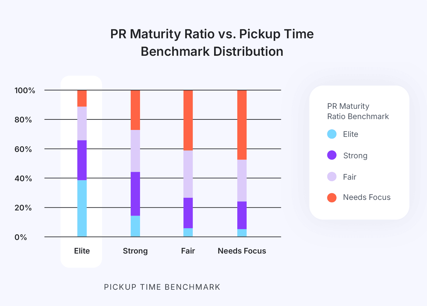
- PR Pickup Time: Measures the time a pull request waits for someone to start reviewing it.
- Low Pickup Time represents strong teamwork and a healthy review process. When a PR is picked up and reviewed within 24 hours, the code is still fresh in the mind of the developer. This reduction of cognitive load saves a significant amount of refocus time.
- Long Pickup Time is an indication of a common workflow bottleneck. Either the team isn’t aware a PR is ready for review or there aren’t enough developers taking on reviews. In both instances, a longer transition time between handoffs correlates to higher cognitive load (re-focus time) and reduced efficiency.
- PR Review Time: Measures the time it takes to complete a code review and get a pull request merged.
- Low Review Time correlates to small PR sizes, reduced code complexity and short cycle time. The caveat here is to make sure your review depth (the number of comments per review) is consistent between two and four.
- Long Review Time indicates large PR sizes, a lack of focus time and/or quality issues. Regular interruptions during a large PR review increase review time due to the developer needing to “get back into” the task. In a similar light, the longer a PR review takes, the less fresh the code will be in the mind of the owning developer. High rework rates also correlate to long review times.
- Merge Frequency: Measures the rate at which developers are able to merge code branched back into the mainline or trunk. This can be thought of as both an efficiency metric and a measure of the developer experience.
- Low Merge Frequency is an indicator of process bottlenecks (like waiting for reviews), quality issues (lots of back and forth on PRs or merge conflicts), too much WIP causing split focus, large PRs, an inefficiency PR process, or some combination of these. Adopting a culture of Continuous Merge will help increase merge frequency, reduce developer toil, and improve the developer experience.
- High Merge Frequency indicates a smooth and efficient PR review process and a healthy SDLC. Code quality is high, work doesn’t get stuck, PRs get routed appropriately, and the developer experience is good (merging devs are happy devs).
- Deploy Time: Measures the time from when a branch is merged to when the code is released.
- Low Deploy Time correlates to high deployment frequency and a more stable production environment. Modern development practices like CI/CD, Continuous Merge, and automated testing improve the time to production and the shorten feedback loop from users.
- High Deploy Time correlates to manual efforts and low code quality. Build failures can be reduced by encouraging smaller PR sizes and instituting a dynamic and appropriate PR review process–ex. automatically routing PRs to the right audience and not requiring 2 reviews for minor docs changes.
DORA Metrics
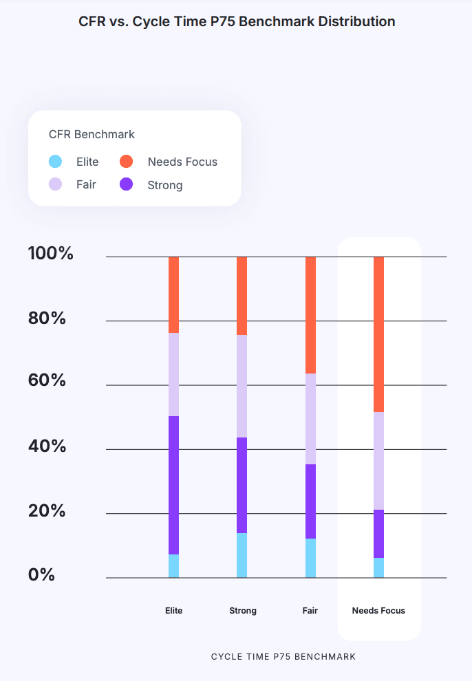
- Cycle Time: Measures the amount of time from first commit to production release. It is a metric borrowed from lean manufacturing, and it is one of the most important metrics for software development teams.
- Short Cycle Time demonstrates that an organization is delivering value to customers at a faster rate. Short Cycle Time correlates to small PR sizes, a healthy review process, and high deployment frequency. Overall, teams with an elite cycle time are able to deliver more features predictably and at a higher quality.
- Long Cycle Time is caused by multiple reasons, the most common being bottlenecks within the PR review process. Longer cycle times reduce team efficiency as well as the ability to deliver features predictably.
- Deployment Frequency: Measures how often code is released into production.
- High Deployment Frequency represents a stable and healthy continuous delivery pipeline. Elite development teams are deploying small chunks of code to production multiple times a day to improve the user experience and shorten the feedback loop.
- Low Deployment Frequency is an indicator of either (or both) significant bottlenecks in a delivery pipeline or a culture of large deployment events that may increase the likelihood of production instability.
- Change Failure Rate (CFR): Measures the percentage of deployments that break something or create an outage/failure in production.
- High CFR can most often be attributed to poor code quality stemming from a less-than-stellar PR review process. Teams with a high CFR likely produce large PRs, conduct shallow reviews (ex. PR with 500 lines of code and a single comment: “LGTM”), and/or have many PRs merged without a review.
- Low CFR is a great attribute for a dev team (with one exception). Low CFR means high code quality, free from bugs, that works in production–often the result of producing small PRs that get adequate reviews before being merged/deployed.
- Note: Teams should look at CFR together with Deployment Frequency to get the complete picture of their overall deployment health. Low/High CFR doesn’t mean much if the team is only deploying once per month–though even in that scenario, low CFR should be the goal.
- Note: Teams should look at CFR together with Deployment Frequency to get the complete picture of their overall deployment health. Low/High CFR doesn’t mean much if the team is only deploying once per month–though even in that scenario, low CFR should be the goal.
- Mean Time to Restore (MTTR): Measures the average time it takes a team (or organization) to address an outage in production and restore a service.
- High MTTR can usually be attributed to things like large PRs, complex code, too much WIP, and communication breakdowns. Most often though, the culprit is large PRs (and associated deployments). When something breaks, those responding to the outage need to review the code, find the bug, and address the issue. The more code to review, the longer the process will take.
- Low MTTR means fast response times and overall good code quality (stemming from small PRs). Less code to review translates to root causes being found faster translates to services being restored faster.
Predictability Metrics
- PR Size: Measures the number of code lines modified in a pull request.
- Small PR Sizes are easier to review, safer to merge, and correlate to a lower cycle time.
- Large PR Sizes directly correlate to higher cycle time and code complexity. High PR sizes are the most common cause of a high cycle time.
- Rework Rate: Measures the amount of work that involves changes made to existing code that is less than 21 days old.
- Low Rework Rates are an indication of higher overall code quality and a strong PR review process.
- High Rework Rates signal code churn and is a leading indicator of quality issues.
- Refactor Rate: Related to Rework Rate, but with one key difference: the “age” of the code. Refactor Rate measures the amount of work that involves changes to existing code older than 21 days.
- Low Refactor Rates mean your team is likely focused on new feature work and innovation. While that generally means higher code quality and a strong PR review process, remember that refactoring is a normal part of a healthy engineering practice.
- High Refactor Rates indicate that too much code is churning. You may have a quality issue or a less-than-ideal review process. You likely need to improve quality and focus more on new value creation.
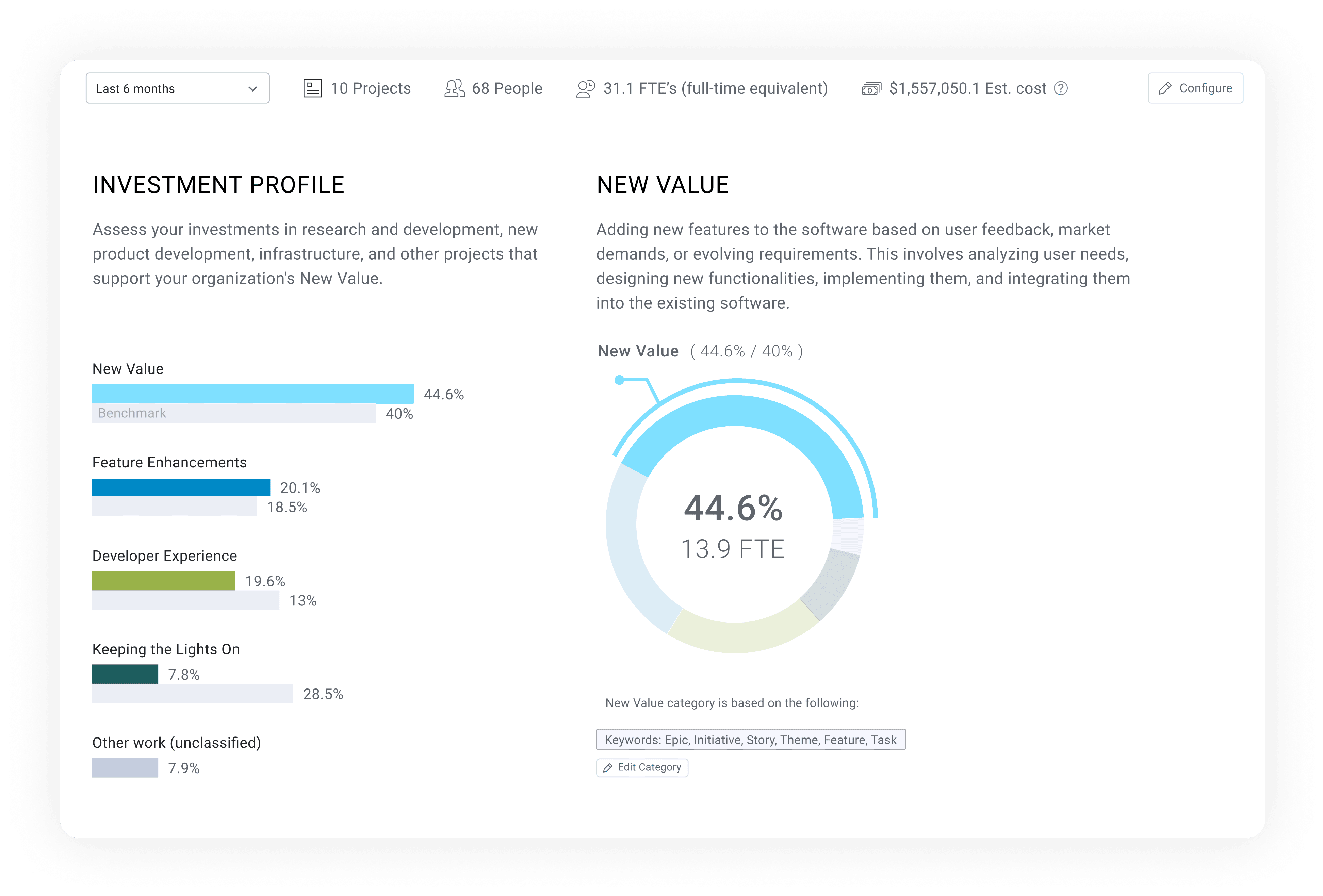
- Note: A good best practice is to avoid rework as much as possible. Refactoring is much more nuanced–refactoring legacy code as part of paying down tech debt should be included in an engineering team’s plan. Leaders should work to strike a healthy balance of new innovation and keeping the lights on. Check out the Summer Launch recap to learn how LinearB can help teams do this with the all-new Investment Profile dashboard.
Accuracy Scores
Accuracy Scores measure scoping, planning, and execution. While these metrics measure different things, they should be viewed together as this approach provides the most insight and clarity into a team’s ability to get things done and move projects (and the business) forward. Look at the table below to see the relationship between Planning Accuracy and Capacity Accuracy.
High Capacity Accuracy (85% - 115%) | Low Capacity Accuracy (<80%) | |
High Planning Accuracy (75% - 96%) | Your project and or team is doing extremely well! Keep it up! If other projects are not trending so well, consider moving some resources around | Your team scoped the iteration well, but they aren’t necessarily responding to normal changes and fluctuations Work on adapting to the needs and priorities of the business |
Low Planning Accuracy (<70%) | Execution is good, but you’re focusing on the wrong things Scope creep and unplanned work is taking up too much time Talk to PM about added work and prioritize your planned work | You’re taking on too much work – splitting focus and increasing delay risks You need to scope down and focus on your planned work Would be a good time to inquire about additional resources if possible |
- Planning Accuracy: Measures the ratio of planned work vs. what is actually delivered during a sprint or iteration.
- High Planning Accuracy indicates a high level of delivery predictability. High predictability within a sprint or over the course of several sprints indicates that teams are able to deliver what they promised, on time. Stakeholders around the business should have a high degree of confidence that a team with high Planning Accuracy will meet deadlines.
- Low Planning Accuracy is an indication of too much unplanned/added work, shadow work and high code churn. Missed delivery deadlines and high carryover are the most common result of low planning accuracy. If Planning Accuracy is low and there is a high degree of unplanned or added work, a conversation with Product Management may be warranted.
- Capacity Accuracy: Measures all completed (planned and unplanned) work as a ratio of planned work.
- High Capacity Accuracy indicates that a team is taking on the right level of work and is able to execute well.
- Low Capacity Accuracy means that a team is working beyond their ability to execute and deliver on promises. It can also be an indicator that the team isn’t adapting to normal fluctuations in engineering and/or business priorities.
In rare cases teams may have too high Planning Accuracy (>95%) and too High Capacity Accuracy (>115%). That means they aren’t taking on enough planned work and should work to scope iterations better.
Again, the clearest picture of scoping, execution, and predictability will emerge when Accuracy Scores are looked at together.
2024 vs 2025: What’s New this Year?
This year’s report includes 7 brand-new metrics, plus our sample size has doubled from last year, with our analysis now spanning 3,000+ teams, 167k+ contributors, and 6.1+ million PRs. We’re also including new research on bot-generated PRs.
New Developer Productivity and Developer Experience Metrics
- Approve Time: Measures the time from the first comment on a pull request to when the PR is first approved.
- Merge Time: Measures the time from first approval to when the PR is merged..
- PR Maturity: The ratio between the total changes added to a PR branch after the PR was published and the total changes in the PR. Example: A PR was merged with a total of 100 lines of code. 20 lines were modified since the PR was published. In this case, PR Maturity is 80% (0.8).
Why We’re Including Them:
- Approve Time and Merge Time split Review Time into two sub segments with distinct dynamics - use this additional level of detail to more accurately diagnose your code review bottlenecks.
- PR Maturity gives a unique view into the impact of code reviews, highlighting ineffective review (very high PR maturity, PRs go nearly unchanged through review), as well as premature review (low PR maturity, more work should be done by the developers to get the PRs to a better state prior to taking scarce review cycles).
New Project Management (PM) Hygiene Metrics
- Issues Linked to Parents: The percentage of issues or tickets with active work that are linked to a parent issue, such as an epic or story. This does not include subtasks.
- Branches Linked to Issues: The percentage of code branches that contain a reference to specific PM issues, providing visibility into the alignment of code changes with planned tasks.
- In Progress Issues with Estimation: The proportion of ongoing PM tasks that have time or effort estimates assigned.
- In Progress Issues with Assignees: The percentage of active PM tasks that have a designated team member responsible for completing them.
Why We’re Including Them:
- Both Issues Linked to Parents and Branches Linked to Issues are metrics that engineering teams can use as proxies for traceability. Optimizing for these metrics will make it easier for teams to monitor development progress and ensure that actual dev work is tied to defined, planned work items.
- Tracking both In Progress Issues with Estimation & In Progress Issues with Assignees helps teams ensure effective planning and ownership for work items, aiding in predictability accountability and effective workload management.
5 Key Takeaways from the 2025 Benchmarks Report
Key Takeaway #1: PR size is the most significant driver of velocity across the PR lifecycle.
PR size plays a critical role in how quickly code is shipped, since this metric directly impacts each subsequent phase of the development and review process, from PR pickup to merge. When pull requests are small, they tend to be less complex and lower risk, allowing reviewers to quickly understand, approve, and merge changes. Conversely, larger PRs often require more in-depth reviews due to the complexity and higher likelihood of bugs, leading to lengthy feedback loops that have a compounding effect on velocity.
Key Takeaway #2: Poor PM hygiene is directly correlated with shorter cycles.
Paradoxically, poor PM hygiene may correlate with shorter cycles. For many teams, moving fast is synonymous to forgoing process and formal overhead. While this may be the right mode for some, care must be taken to track whether this approach also entails superficial reviews and reduced quality. Further, the reduced of visibility and tracking in the Project Management systems often leads to impaired predictability - a trait businesses often value more than raw speed.
Key Takeaway #3: Organizations with longer Cycle Times tend to have a higher rate of failures in production.
When delivery cycles are longer, every deployment to production tends to be larger, more complex, and more prone to have quality issues. Contrary to common instinct, and much like riding a bicycle, going faster actually helps stability. Teams that ship many small changs in short cycles have lower risk in each deploy, and can fix production issues faster. They have typically also developed more robust automated testing capabilities that allow them to move faster in the first place - contributing to overall stability and reducing production failures.
Key Takeaway #4: A higher PR Maturity ratio correlates with higher velocity.
The maturity of a team’s PRs serves as a strong indicator of how efficiently code moves through the development pipeline. When developers take the time to ensure PRs are thoroughly prepared before publishing them, they reduce the delays caused by fixes and additional reviews. Since every handoff between developers and reviewers requires an expensive context switch, anything the PR author can do upfront while creating the PR is almost always more efficient than having a reviewer do it. One caveat is when PR maturity is too high - signaling that the review process is not effective as it doesn’t cause PRs to be modified.
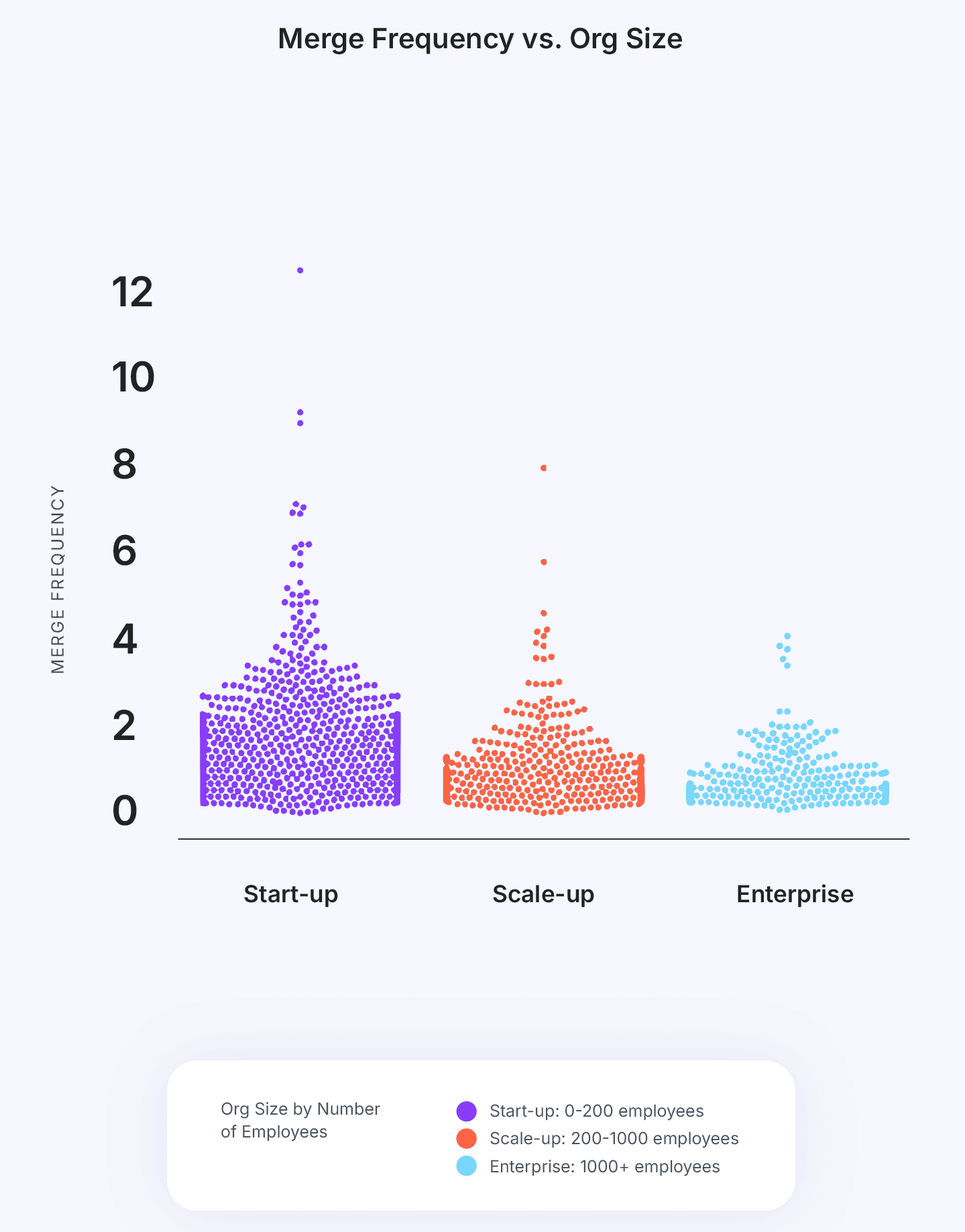
Key Takeaway #5: Start-up engineering organizations tend to ship code at a faster rate than Scale-ups and Enterprises.
Unlike larger organizations, start-ups often work with smaller, cross-functional teams that operate with minimal bureaucracy, leading to quicker decision-making and less friction across the development process. Start-ups typically prioritize speed and market responsiveness over formal process, allowing engineers to quickly test, iterate, and release code. Additionally, start-ups are less likely to face complex compliance, security, or operational constraints, which often slow down deployment in larger companies. In contrast, scale-ups and enterprises have to manage legacy systems, ensure stringent quality control, and coordinate across multiple teams, which can introduce delays downstream. This freedom from extensive coordination and risk mitigation requirements allows start-ups to adopt an agile mentality, which enables them to ship code at a pace that larger organizations may struggle to match.
What Now?
Understanding your team’s current performance is the first step to creating a culture of continuous improvement. The Software Engineering Benchmarks Report is one of the best resources for gaining insight into current performance and contextualizing it with industry data.
You can get your free copy of the report right here!
If you’re ready to discover how your team performs against industry standards today, book a free engineering metrics benchmarks consultation.