“What value is your department bringing to the company?”
The VP of Sales will pull out a report on the contract amounts of new partnerships. The CMO will talk about the new leads they’ve generated. But what about you? What reports or metrics will you bring to the table? And how will you articulate your plans to deliver on time without insights?
In this article, we’ll see how git dashboards can give you valuable, data-driven insights into your developers’ work and what’s holding them back. We’ll also look at the limitations of some git dashboard tools and how you can overcome them to truly understand the business value your engineering org is creating.
Table of Contents
- What Is a Git Dashboard?
- What to Include in Your Git Dashboard
- Top 4 Git Dashboard Tools
- How to Improve Your Git Analytics
What Is a Git Dashboard?
At the simplest level, a git dashboard is a collection of metrics. You can think of it like a health chart created at the doctor’s — it gives a comprehensive picture of the patient’s health based on numbers. But instead of patient health, a git dashboard shows your organization’s health, and instead of blood pressure and beats per minute, it shows you metrics related to productivity and efficiency.
A good git dashboard needs to be:
- Accurate
- Current
- Unified
- Easy to set up
- Easy to manage
- Easy to understand
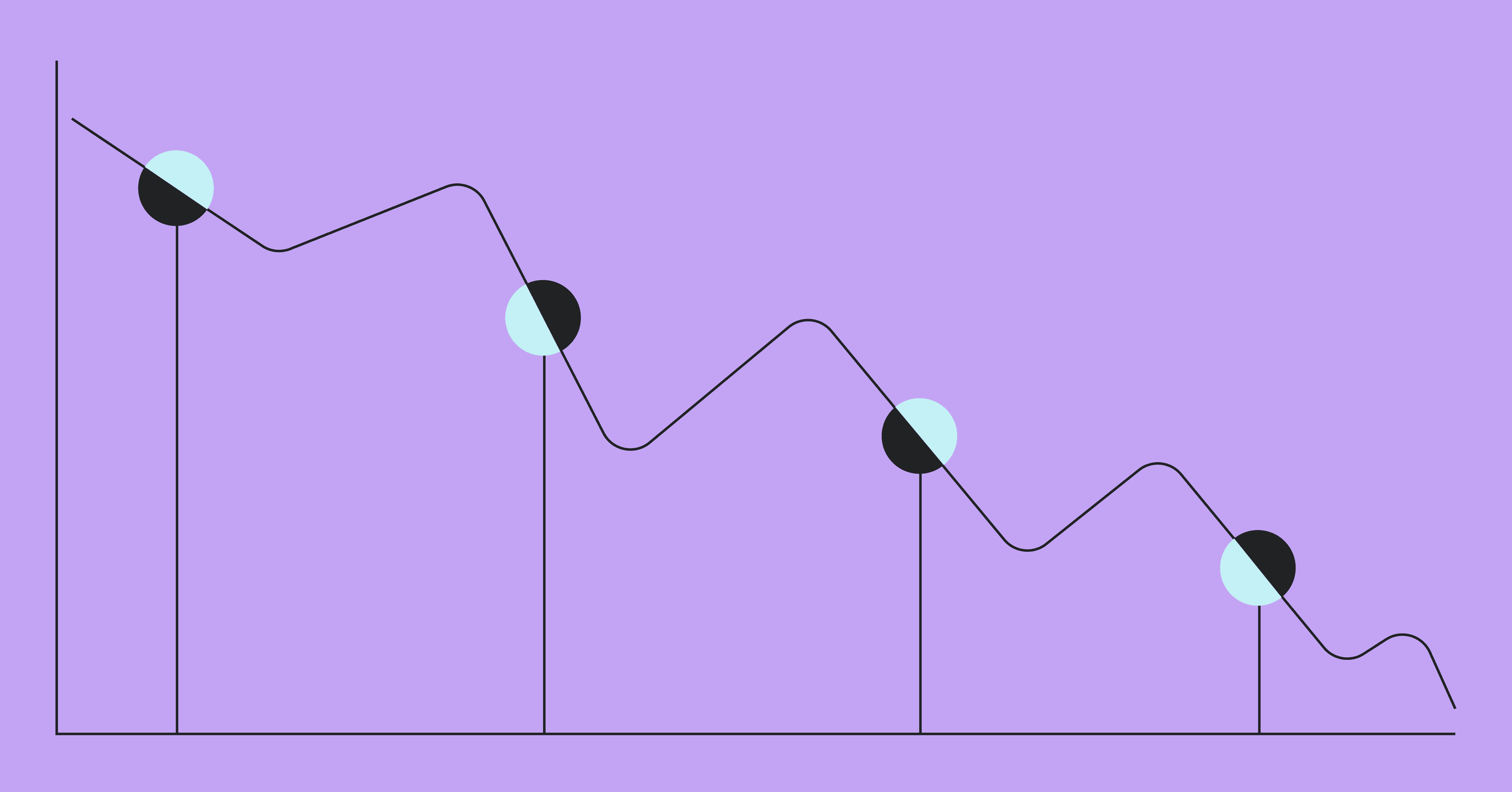
Most importantly, it needs to consist of the right metrics. Many teams are now using metrics, but few are using the right ones. It’s even rumored that one company uses metrics like total lines of code to decide who gets laid off! (We’re talking about you, Elon… 😬)
Check out how Netflix chooses the metrics on their git dashboards:
What to Include in Your Git Dashboard
If you want your git dashboard to provide you a clear and accurate picture of your teams’ health and performance, you can’t arbitrarily choose the metrics on it. So we’ve picked the three best metrics for your dashboard that will help you show the other execs what your org is really up to.
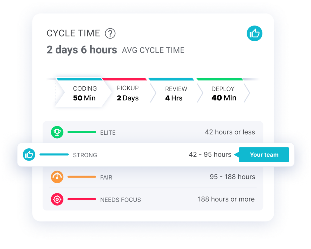
1. Cycle Time
Cycle time is a powerful metric because it summarizes so much of the development process into one concise number. But this can be a limitation, with many things contributing to a high cycle time.
To get around this issue, and truly understand why your cycle time is high, you need to break it down into its four phases:
- Coding Time: Time between the first commit made to a branch and when a pull request is submitted
- Pickup Time: Time between when a pull request is issued and a review has started
- Review Time: Time it takes to complete a review
- Deploy Time: Time between when the code is ready and when it is live in production
When you have this clear breakdown, you can see which phase is holding you back, and create a plan to remove the bottlenecks plaguing your devs in this phase.
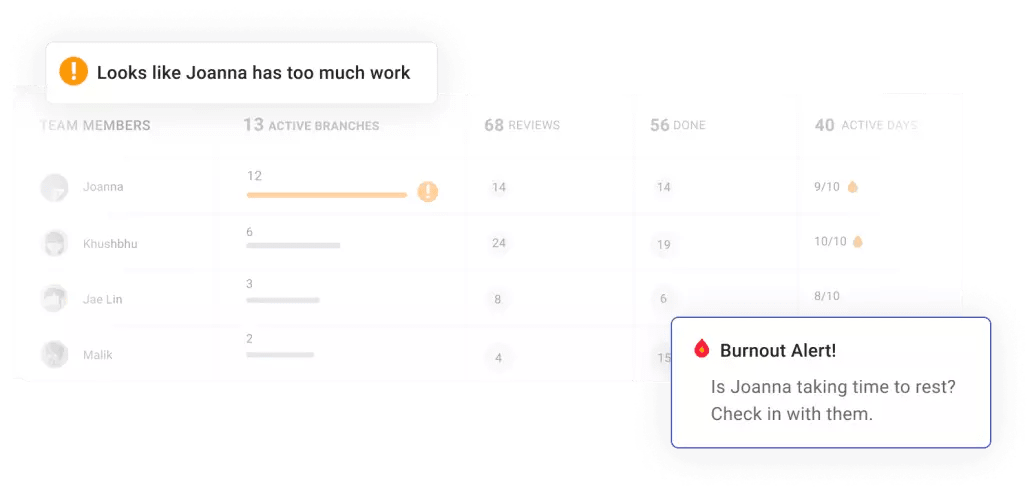
2. Work In Progress (WIP)
This metric tells you how much work is on a developer’s plate at one time. Too much WIP correlates with excessive task switching, a decline in productivity, and dev burnout. But when you can clearly see who’s doing what during an iteration, you can identify who’s being pushed to their limits.
You can then use this as an opportunity to reorganize your priorities and ensure your productivity isn’t suffering because of burnt-out, frustrated, overworked devs. Tracking WIP also helps you see what your teams are working on, so you can find out whether their tasks align with your business goals.
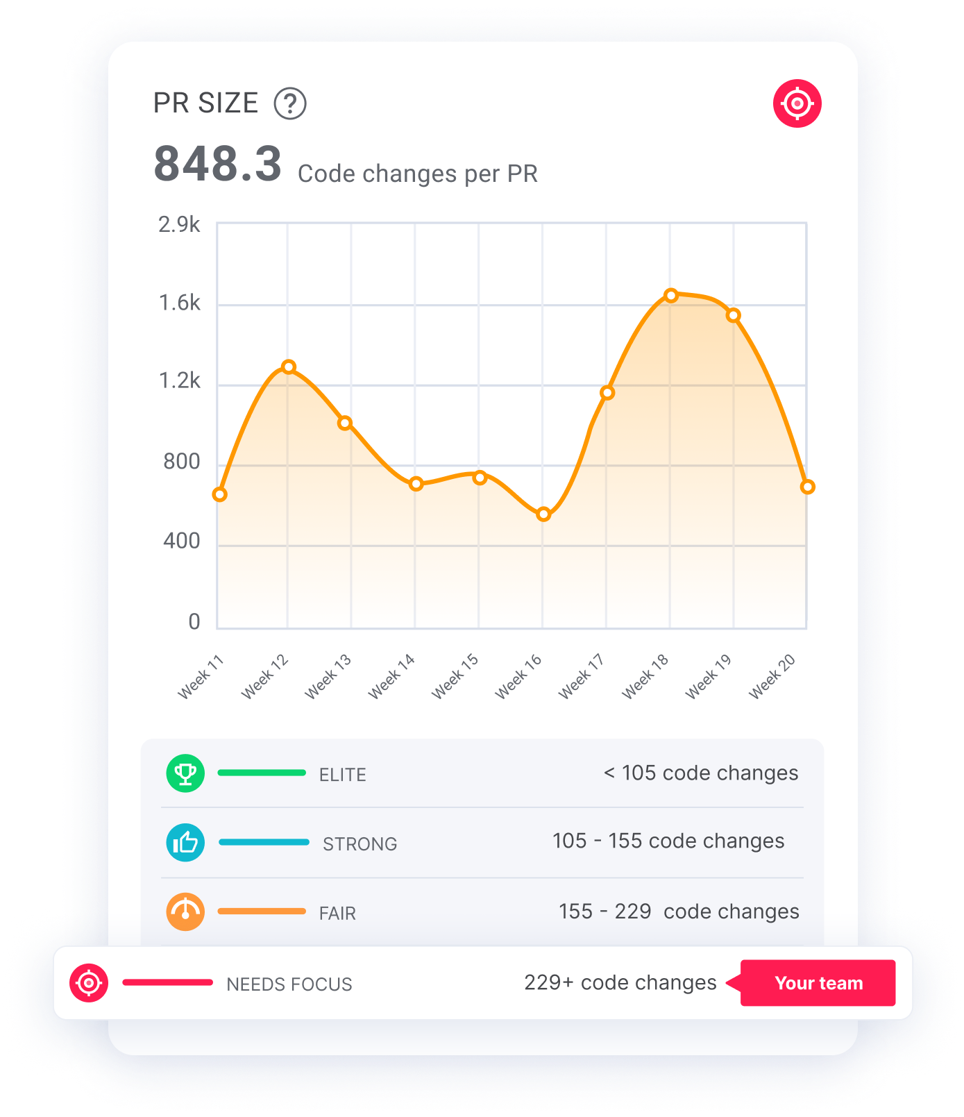
3. Pull Request Size
Our research found that the single most effective way to decrease your cycle time is to reduce the average size of your developers’ PRs. This surprised us too! But it makes sense when you think about it. Smaller PRs are more likely to get picked up because reviewers know they can get them done faster.
So if you notice your pickup and review times are through the roof (and not in a good way), try monitoring the PR size on your git dashboard tool. You can then help devs keep their PRs within a certain size, reducing your cycle time.
Top 4 Git Dashboard Tools
Even if your git dashboard uses all the best metrics, you may not get much use out of it if it’s hard to work with. As we said earlier, any dashboard is no good if it’s not accurate, current, unified, and easy to set up, manage, and understand.
The four git dashboard tools below can be a good starting point for you, and we’ve highlighted some of their limitations to make your decision easier.
1. GitHub API
GitHub’s API provides tools like Actions and Apps to make it easy to leverage the API. GitHub also makes it easy to get access to the raw data you need to build your own git dashboard and include all the key metrics: Cycle time, WIP, and Pull Request. But as with any build-your-own solution, it can be time-consuming to create and maintain. So it might be better to find a git dashboard tool with everything you need right out of the box.
Though it’s a very comprehensive solution, we all know building a git dashboard isn’t the best option. Source: Created using imgflip
2. Jira
You can connect Jira to your CI/CD tooling and leverage Jira’s reports functionality to patch together a dashboard of sorts. The key report in a Jira git dashboard is the cycle time report. It’ll show how your cycle times evolve. If you spot outliers, you can work your way down into the specific issues causing bottlenecks. But this cycle time report only shows the overall cycle time — it doesn’t break it down into phases.
With Jira’s Align tool, you can also get a work-in-progress report. You can see a breakdown of WIP by developer as well as some predictive stats on whether the sprint as a whole is on track to complete the story points initially committed to.
The main problem with this report is that it requires you to purchase yet another plan with Jira. And because it lives in the Align tool, you may not be able to use it in a dashboard with reports from other tools, depending on what other Jira plans you have access to.
3. GitLab
GitLab has been investing in their analytics to become an all-in-one CI/CD platform. They now have what they call a Value Stream Mapping (VSM) tool. Long story short, it’s a cycle time tool.
Unlike Jira, GitLab enables you to break cycle time down by subphase. However, this git dashboard tool only shows you the current cycle time. You can’t compare it with cycle times from previous iterations. GitLab also has stats on merge requests — but they don’t track PR size, the most important PR stat!
4. LinearB
LinearB gives you a full git dashboard with all the key git metrics right out of the box. But what sets LinearB apart is that it correlates your git data with Jira data. This way, you can understand where your development resources are going, where bottlenecks are holding developers back, and how effectively your org is executing plans.
For example, with many metrics, like cycle time, you can get one-click context to see the branches and Jira issues driving that phase’s lead time. You can go from seeing a problem to identifying its causes — in just one click.
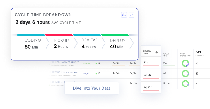
Get context around cycle time bottlenecks in one click. Diving into your data has never been this easy. Get started with our free-forever account today!
How to Improve Your Git Analytics
As the saying goes, “The first step to getting better is admitting that you have a problem.” But an even more important step is identifying the problem. Otherwise, you’ll never get better, and your company won’t understand how valuable your engineering org is. That’s where metrics come in.
Building software in a team setting is a complex process. With so many moving parts, it’s easy for things to break — and it’s hard to understand why. A git dashboard gives you a single, unified view of your engineering teams’ health and processes. Knowing where your devs are struggling can help you give them solutions to improve developer experience, which also boosts their productivity.
With a tool like LinearB, you can quickly identify bottlenecks and seamlessly move from identifying the problems to solving them. After you understand what’s going on with your teams, you can set Team Goals to curate an action plan for your devs, like reducing your PR sizes.
You can also use our workflow automation tool, WorkerB, to help you progress toward achieving this goal. For instance, it can notify a dev whenever they create a PR that’s bigger than the desired PR size. With this automation, you pave the way for your devs to unlock new levels of efficiency, making your organization a well-oiled software development machine!
Join the thousands of companies already leveraging the LinearB recipe to improve engineering efficiency.
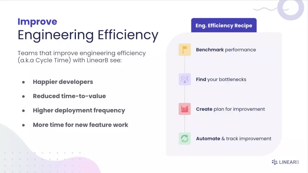
We know that improving engineering efficiency is important. Learn more about our four-step recipe for improvement.